From innovative search functionalities to comprehensive market insights, each real estate agent website must stand out to make the real estate adventure productive and enjoyable. These websites are digital masterpieces meticulously crafted by agents and brokerages that excel as field experts and artisans in creating engaging online user experiences. Join me as I unveil these amazing real estate agent websites and gather inspiration for your own.
1. Shannon Lavin
-
Best feature: Off-market listings highlight
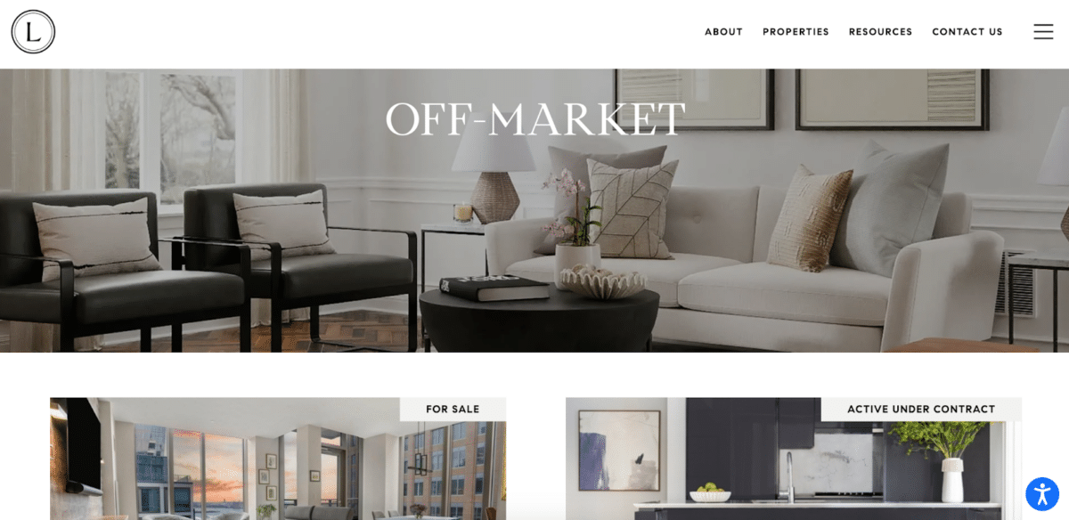
Shannon Lavin’s website, particularly its off-market listings page, is a treasure trove for those seeking exclusivity in the bustling Boston real estate market. This standout feature is a game-changer for buyers and sellers who desire privacy and early access to premium properties before they hit the mainstream market. It’s a brilliant strategy for real estate agent websites to leverage the allure of exclusivity and direct access, making her website a go-to destination for elite buyers and sellers in the competitive Boston landscape.
2. Grist Realty
-
Best feature: Showcasing additional real estate services
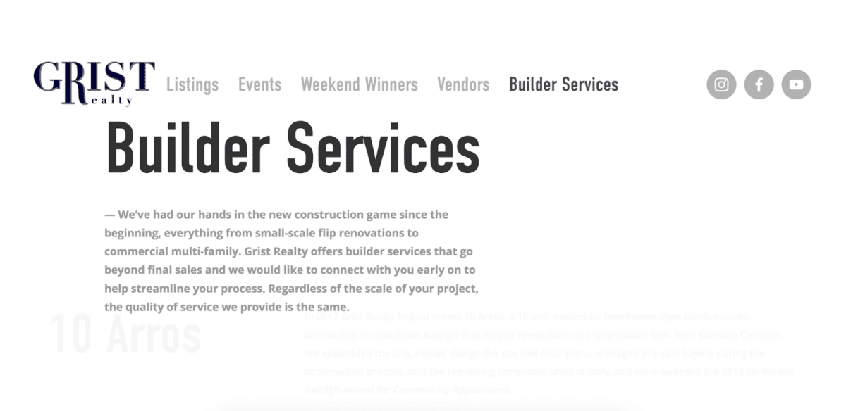
Grist Realty’s dedicated builder services page is a standout feature that brilliantly showcases its comprehensive support for homebuilders. This unique offering on its website not only highlights its specialized expertise in this niche but also provides a strong selling point for potential clients in the construction and development sectors. By detailing services such as market analysis, advertising strategies, and sales management, Grist Realty positions itself as a key partner for builders looking to maximize the marketability and success of their projects.
3. Campion and Company
-
Best feature: MLS search accessibility

Diving into the world of real estate is made refreshingly simple with the easy MLS search feature prominently displayed on the homepage of Campion and Company’s website. This intuitive IDX tool invites users to start their property journey the moment they enter the site, simplifying the search process and enhancing the overall user experience. It’s a clever strategy that facilitates immediate engagement and showcases the agency’s commitment to efficiency and user-centric design.
4. Dora Puig
-
Best feature: Keeping clients informed with updated news

On Dora Puig’s real estate website, up-to-date real estate news stands out as a key resource for anyone invested in the Miami market. This feature provides visitors with valuable insights, market trends, and the latest updates in real estate, directly contributing to informed decision-making. By integrating current news into her website, Dora positions herself as a leading authority in the industry. She keeps her clients and visitors well-informed, enhancing their ability to make timely and effective real estate decisions.
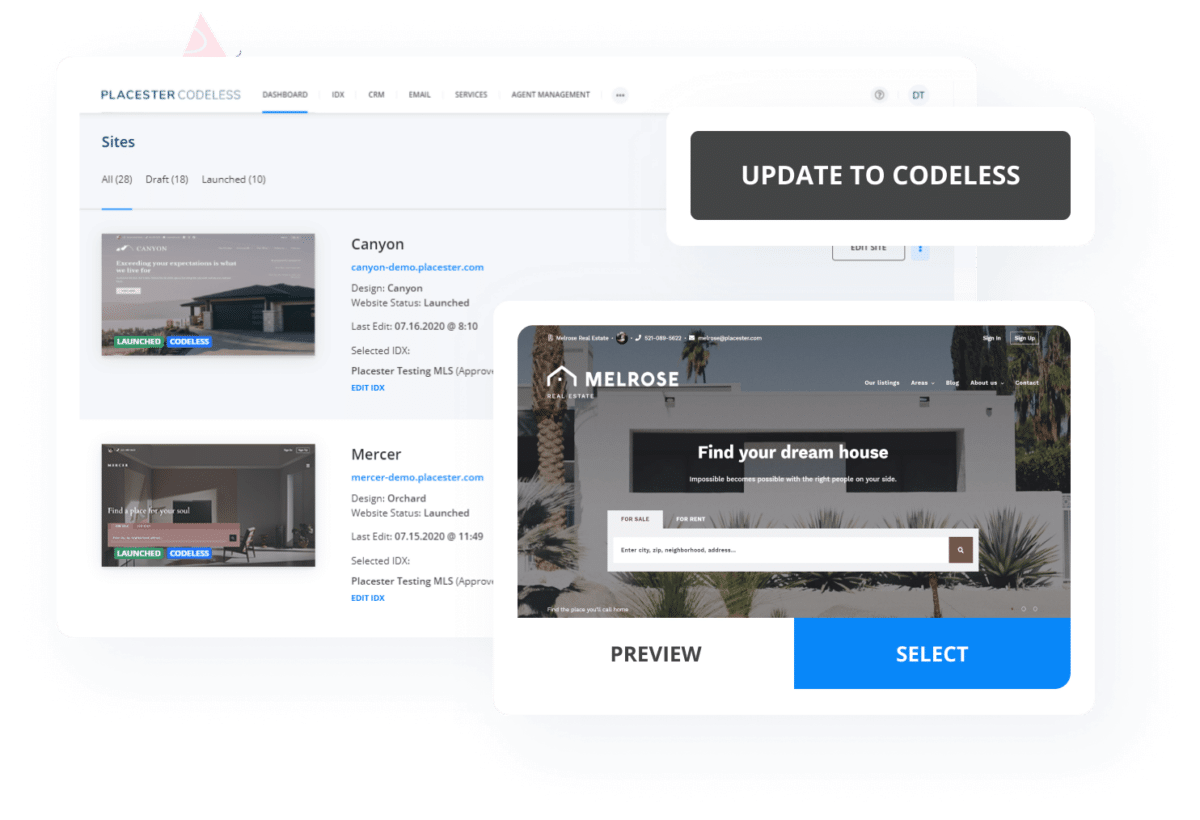
To quickly launch websites with a dedicated news section, Placester offers a superb solution with its quick templates. Placester’s templates are specifically designed to meet the needs of real estate professionals, providing aesthetically pleasing designs and essential functionalities that can be easily customized. Whether you aim to showcase property listings, share market insights, or highlight your agent profile, Placester’s user-friendly platform allows you to do so with minimal fuss and maximum impact.
5. Angela Andronache
-
Best feature: Expert insights through engaging blog posts

Angela Andronache’s real estate website goes beyond showcasing properties by offering a blog that serves as a rich resource of informative posts. Her “Stories” section is a deep dive into various aspects of the Miami real estate market, providing readers with expert advice, trend analysis, and valuable insights. By consistently updating her blog with relevant and engaging content, she keeps her audience well-informed and connected, encouraging frequent visits to her site for more than just property listings.
6. Baylor Real Estate
-
Best feature: Niche market mastery
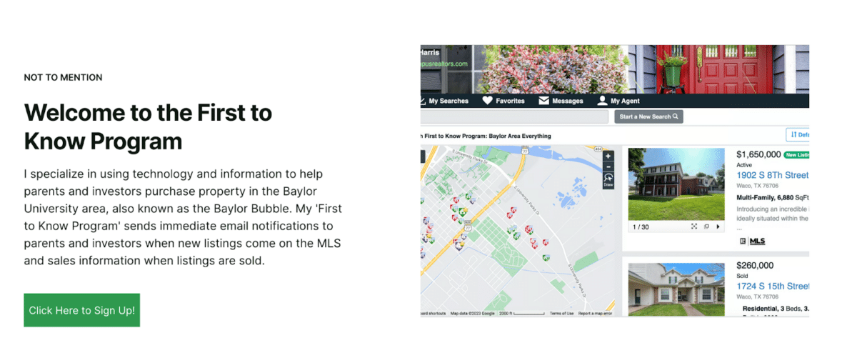
Specializing exclusively in the Baylor University area, Baylor Real Estate Alerts caters to a unique real estate market segment. This strategic focus allows the website to deliver highly relevant listings and insights to students, faculty, and property investors specifically interested in the Baylor Bubble. The targeted approach ensures that every piece of content, from property listings to market advice, is tailored to meet the needs of the Baylor community. It’s an excellent example of how a sharp focus on a specific niche can enhance service delivery, making the platform a go-to resource for those seeking to engage with real estate in this academic enclave.
7. Gold Peach Realty
-
Best feature: Seamless client engagement
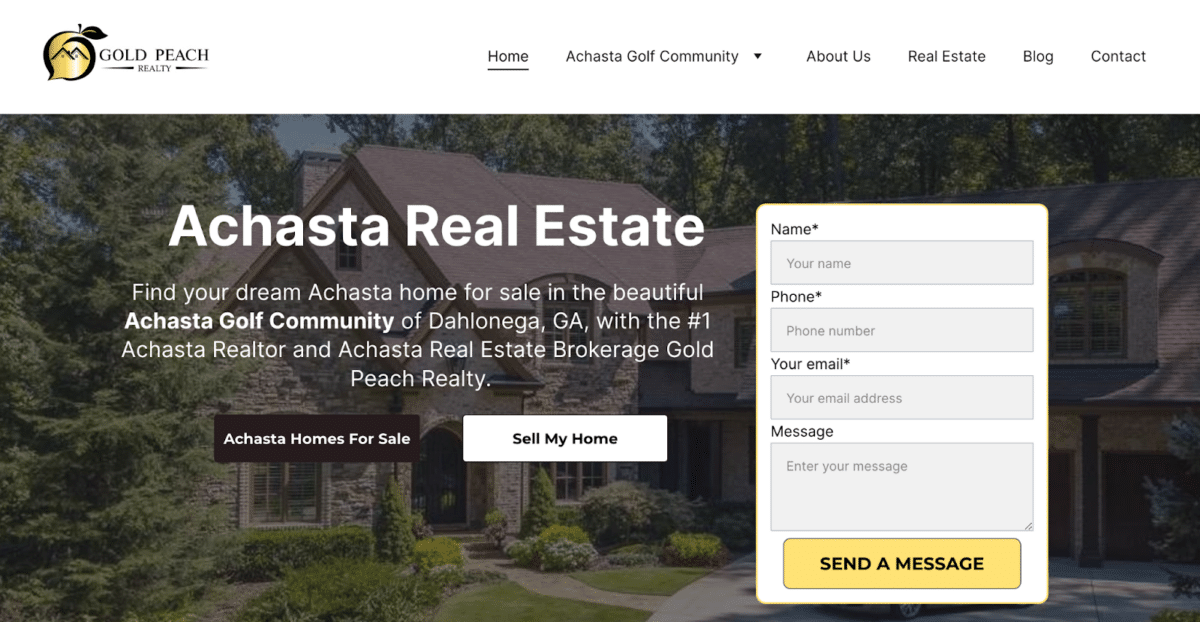
Gold Peach Realty smartly integrates a contact form on its homepage, streamlining the process for clients to reach out without needing to search multiple pages. This strategic placement enhances user experience by providing immediate access to inquiries and effectively captures leads directly from the landing page. The immediate visibility of the contact form invites potential clients to connect, ask questions, or express interest in properties, thus increasing the chances of converting visitors into clients.
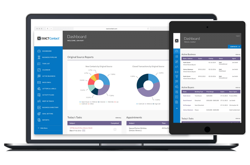
Leads received through the contact form should funnel into a customer relationship management (CRM) system like IXACT Contact. This CRM is specifically tailored for real estate agents, providing tools that streamline client communication, lead nurturing, and marketing automation. With IXACT Contact, agents can keep track of client interactions, set reminders for follow-ups, and even manage newsletters and email campaigns, all from one central platform.
8. Atwater Village Real Estate
-
Best feature: Minimalistic approach
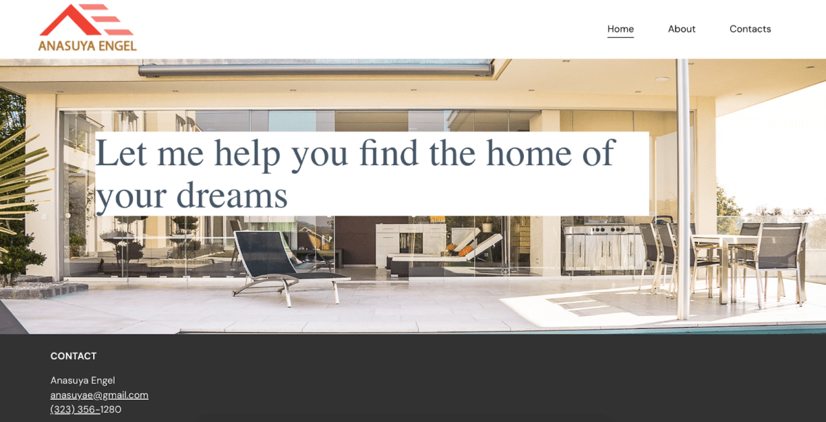
Embracing a minimalist design, the Atwater Village Real Estate website focuses squarely on a clear, direct call to action. This simple landing page approach strips away any potential clutter, allowing visitors to immediately understand what steps they need to take next—let them help you find your dream home. The prominence of the call to action right on the homepage streamlines the user experience. It enhances lead capture efficiency by reducing the time and effort needed to engage potential clients.
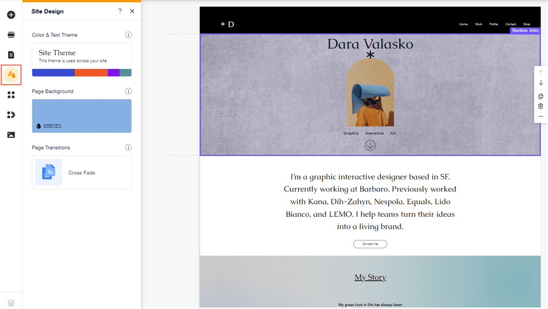
Wix is a great website builder option that offers an ideal solution for real estate agents looking to establish or enhance their online presence with a sleek, user-friendly website. Wix is renowned for its intuitive design capabilities, allowing users to create professional-looking websites easily. Even with no technical expertise, agents can leverage Wix’s vast array of templates specifically tailored for real estate purposes. This platform empowers agents to craft a website that looks great and functions seamlessly, ensuring they can focus on what they do best—selling homes.
9. Christian Angle Real Estate
-
Best feature: Showcasing excellence from the start
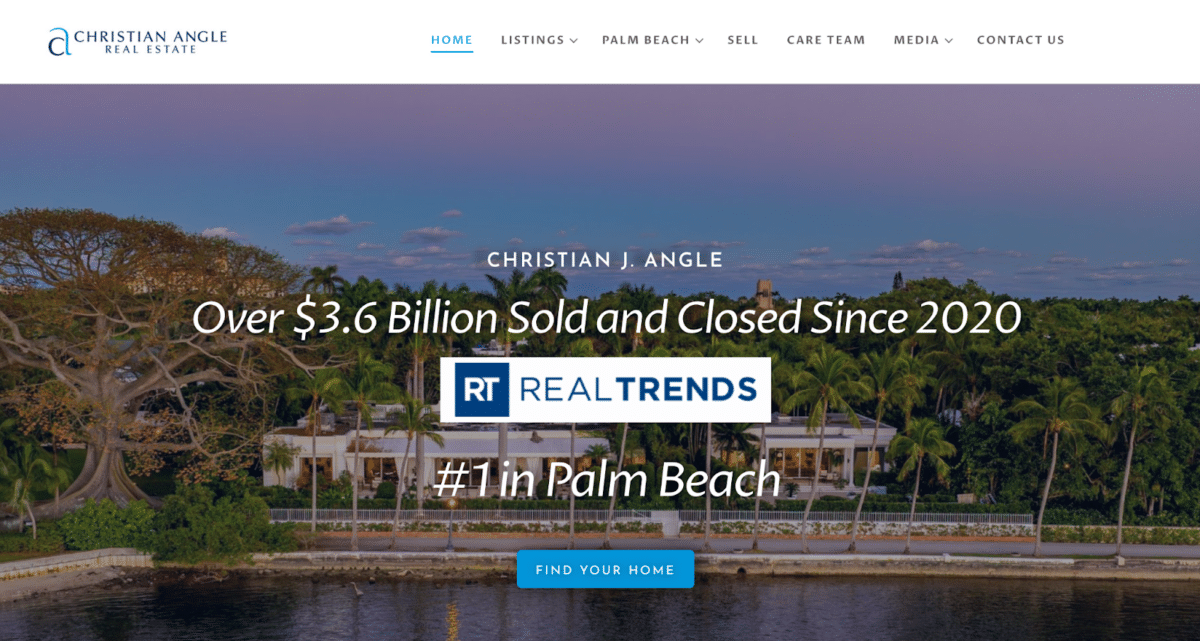
The homepage of Christian Angle Real Estate immediately draws by showcasing its impressive accolades, effectively building trust and credibility right from the first interaction. This strategic display highlights the firm’s industry recognition and success, setting a tone of professionalism and excellence. This approach reassures potential clients of the high-quality service they can expect, positioning Christian Angle Real Estate as a top-tier provider in the market.
10. Chris Cortazzo
-
Best feature: Vivid storytelling through video
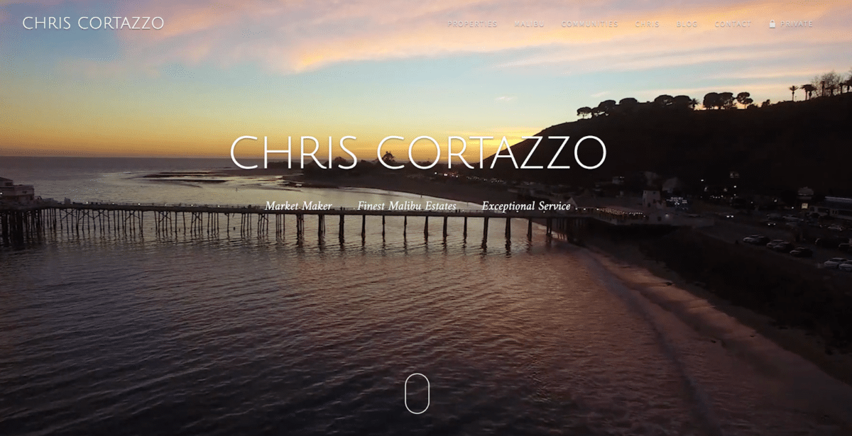
Engaging real estate video content strategically placed on the homepage not only captures the stunning vistas of Malibu but also conveys the distinctive lifestyle of the area, offering potential clients a glimpse into the day-to-day experiences they might enjoy. Chris Cortazzo’s website is a real estate broker website that does this seamlessly. These videos effectively evoke the local ambiance, combining visuals of scenic landscapes with the upscale living spaces that define the region. This approach enhances the effectiveness of real estate marketing by transforming property viewing from a mere transaction to an experiential journey.
11. Carrie Wells
-
Best feature: Welcoming a global audience
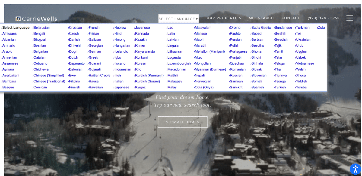
Single property websites should offer a language selection option to enhance accessibility for an international clientele and emphasize inclusivity in the global real estate market. This feature facilitates a smoother browsing experience, enabling visitors from different linguistic backgrounds to navigate the site in their preferred language. Such a thoughtful integration expands the reach and significantly improves user engagement by making the content more relatable and easier for non-English speakers to understand.
12. Jade Mills
-
Best feature: Informative market insights

Jade Mills Estates’ blog is a crucial resource for anyone interested in the luxury real estate market dynamics. It offers detailed analyses of market trends, providing readers with deep insights into what’s shaping the real estate landscape. This content is informative and strategic, helping potential buyers and sellers make well-informed decisions based on current market data. By consistently updating this blog with fresh and relevant market insights, Jade Mills establishes her website as an authoritative source.
13. Casagrande Team
-
Best feature: Center stage branding

Strategically placing its branding at the center of the homepage, the website immediately engages visitors with a solid and memorable impression of who it is. Such a prominent real estate branding ensures that potential clients feel secure knowing they are dealing with established professionals from the first click.
This approach enhances brand recognition and sets a professional tone from the outset, clearly distinguishing their identity in a crowded real estate market.
14. Craig Morris
-
Best feature: Highlighting expertise

One of the best realtor websites featuring a detailed bio is Craig Morris’ site, which effectively bridges the gap between potential clients and his professional world. This strategic placement humanizes his brand and enhances transparency, allowing visitors to gain insight into his successful career and depth of knowledge in the real estate sector. It instills confidence and fosters trust, crucial elements when choosing a real estate agent to partner with in significant financial decisions.
15. The Rubin Team
-
Best feature: Enhanced accessibility
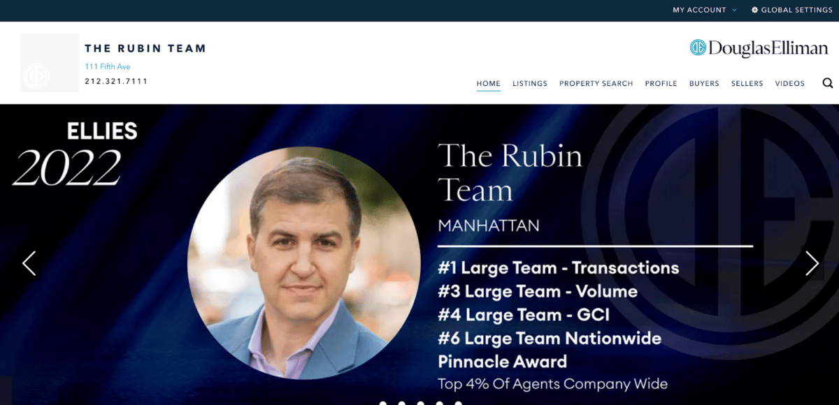
The Rubin Team’s website excels in user accessibility by prominently displaying their phone number in the header. This thoughtful design ensures that clients can easily find contact information without needing to search through multiple pages, streamlining communication and inviting immediate inquiries. The Rubin Team fosters a sense of availability and responsiveness by welcoming calls right from the top of the page. It encourages direct engagement, making it more straightforward for potential clients to reach out with questions or start the buying or selling process.
Tips to Make Your Website Standout
Creating standout real estate agent websites involves more than just listing properties. It requires strategic design, content, functionality, and marketing efforts. Here are five tips to make your real estate website truly stand out:
Tip 1: Leverage High-quality Visuals
Use professional photos and videos extensively across your site. High-quality visuals for cool real estate websites are pleasing and allow potential buyers to visualize themselves in the property. Consider including virtual tours to enhance the experience further. This approach can help set the mood and give a realistic feel of the space, which is essential in capturing the interest of prospective clients.
Tip 2: Optimize for Mobile
With most users now accessing websites from smartphones, your site must perform flawlessly on mobile devices. Ensure the design is responsive, meaning it adjusts seamlessly to fit any device’s screen size. Most website builders offer the ability to optimize the site for mobile devices. Mobile optimization also impacts search engine rankings, significantly enhancing your website’s visibility.
Tip 3: Include Valuable Content
Some of the best real estate broker websites enrich their site with content that buyers and sellers will find helpful. This content can include blog posts about market trends, tips for homebuyers, neighborhood reviews, real estate testimonials from past clients, and advice on home maintenance. Providing valuable content can establish your authority in the real estate field, improving trust and engagement with your audience.
Tip 4: Implement Strong Calls to Action (CTAs)
Your website should guide visitors toward actions you want them to take, such as contacting you, scheduling a viewing, signing up for a newsletter, or requesting more information. Place clear, compelling CTAs throughout your site to drive conversions and ensure these buttons are visible and persuasive.
Tip 5: Focus on SEO
Search engine optimization (SEO) is critical for making your website visible to search engines. Use relevant keywords throughout your site content, meta descriptions, domain names, and alt texts for images. Local SEO is particularly important in real estate, so include location-based keywords and register your business with local listings like Google My Business.
FAQs
What are the essential features my real estate website should have?
A real estate website should include high-quality property images, detailed property descriptions, search functionality with filtering options, a user-friendly contact form, and integration with Google Maps. Additionally, virtual tours, client testimonials, and a blog can enhance the user experience by providing more value to your visitors.
How can I ensure my real estate website is optimized for search engines?
Search engine optimization (SEO) is crucial for real estate websites to increase visibility and attract more traffic. Ensure your site has relevant and keyword-rich content, a mobile-friendly design, fast loading times, and properly tagged images. It’s also important to regularly update your content and utilize local SEO strategies, such as including area-specific keywords and creating listings on local business directories.
Is it better to use a website builder or hire a web developer for my real estate website?
Choosing between a website builder and hiring a web developer depends on your budget, technical skill level, and specific needs. Website builders like WIX or WordPress are cost-effective and usually sufficient for most real estate agents. They offer customizable templates and easy drag-and-drop interfaces. However, hiring a professional web developer might be a better option if you require advanced features or a unique design.
Bringing It All Together
Bringing your real estate agent websites to life should be as dynamic and unique as your brand itself! Think of it as dressing up your digital storefront, where every element reflects your personal style and professional ethos. Whether you’re a high-energy, go-getter agent with a flair for luxury homes or a laid-back, approachable personality specializing in cozy family residences, your website should shout that the moment a prospective client clicks on it.
Ultimately, have fun with it! Your website is your digital handshake, the first and often most critical interaction potential clients have with you. Make it count, make it memorable, and most importantly, make it so undeniably you that when clients land on it, they can’t help but think, “This is exactly who I need to call!”


