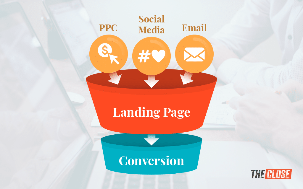
As more buyers and sellers start their home search online, it’s crucial to meet our clients where they are—online. A digital marketing funnel begins with your real estate landing pages, turning a website visitor into a lead in your pipeline. As a real estate agent, you must optimize this page to ensure a steady stream of leads you can convert into clients. I’ll cover the critical elements of an effective real estate landing page, discuss tips on creating your landing pages for real estate, and provide a few examples. Let’s dive in!
Agent Image has paid for this placement. However, our team of experts approved Agent Image as an appropriate product and our content remains editorially independent.
Looking to build a website that focuses on upscale design and support? Agent Image has 24+ years of experience and a portfolio of 26,000+ sites. Book a free consultation and receive 20% off the purchase of any website package.

What Are Real Estate Landing Pages?
A real estate landing page is a dedicated webpage for your business designed to capture leads by providing value in exchange for contact information. It’s different from a general real estate website because it focuses on prompting visitors to act, such as signing up for a newsletter, requesting a home valuation, or searching for properties.
Real estate landing pages are a vital part of your digital marketing strategy because they insert leads at the top of the funnel, hoping to carry them toward taking action, culminating in a sale.
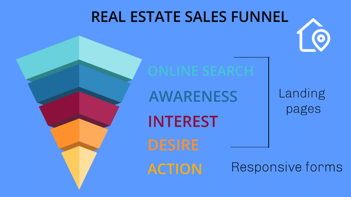
Remember that the realtor landing page is separate from your personal website or business homepage. It is a single page specifically made to capture leads and prompt visitors to act in a certain way, whereas your real estate website is built to house multiple pages with broader information.
Top Real Estate Landing Page Examples (+ Providers)
Before we get into how to create your landing page, you need to see some examples to understand what they should look like and get inspiration for your own. Creating real estate landing pages that convert requires a blend of art and science. You want to balance engaging visuals with strategic content and technical back-end optimization.
Each example below is from a reputable landing page provider, so if you like one of the designs, check out the provider to use their services to create your landing page.
Example 1: Agent Image
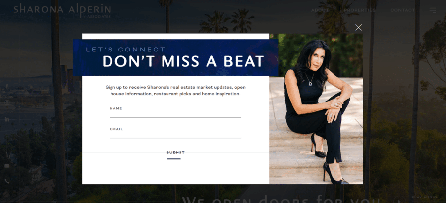
This realtor landing page from Sharona Alperin was created with Agent Image. She has a clear call to action (CTA) reading, “Let’s connect – Don’t miss a beat,” which stands out against the rest of the page in capital bold letters. Sharona also tells the visitor what you’re exchanging for your contact information: market updates, restaurant picks, and home inspiration, all enticing items for a buyer or seller. Agent Image specializes in full agent websites, so you can use their services to complete an online makeover. They also offer IDX and CRM integrations to make sure listings are seen, and leads are captured.
Example 2: AgentFire

Using a home valuation page is a great way to snag seller leads at the beginning stages of the selling process. AgentFire offers multiple landing page options that are engaging and easy to set up. A cool feature from AgentFire is that you can set up realtor landing pages to provide an instant valuation, meaning visitors get a result immediately. However, those are based on algorithms. If you’d like, you can also set the system up to notify you when visitors provide their information and then create a custom comparative market analysis.
Example 3: iNCOM
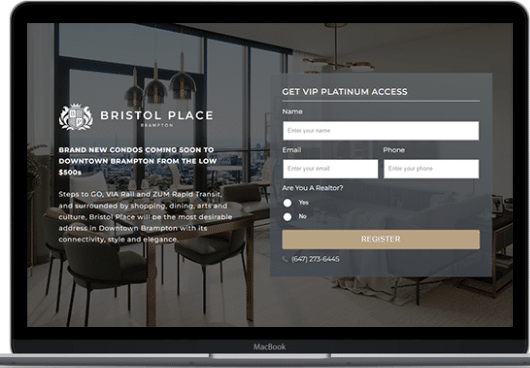
This example from iNCOM entices clients with exclusive “VIP Platinum Access” to brand new condos in exchange for their contact information. This type of landing page is great for realtors who specialize in niches, particularly condo sales. Other iNCOM landing page features include mobile-optimized designs, higher conversion and click-through rates, and lifetime support from the iNCOM team.
Example 4: Placester
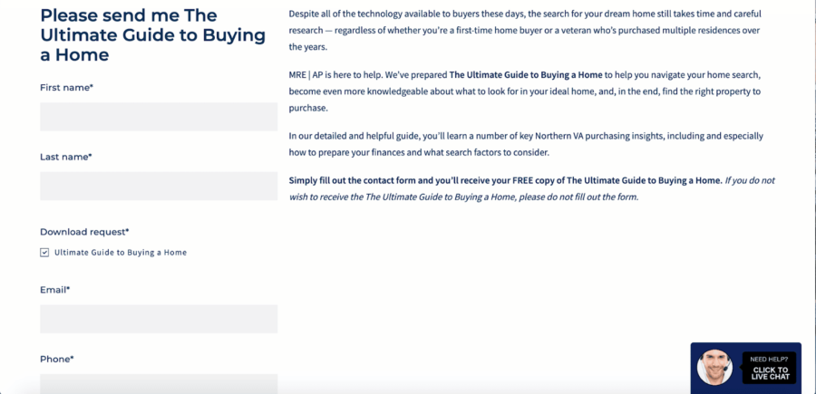
To be a functional landing page, it’s important to provide your visitors with value, like the above example made by Placester for Atoka Properties. In exchange for contact information, visitors will receive a guide to homebuying, which will help them in their journey and encourage them to work with the people who created it—and that’s the way to get people into the sales funnel! Placester has other amazing landing page designs and a Do It For Me lead generation website system where professional designers will create your online pages and maintain your site.
Example 5: Easy Agent PRO
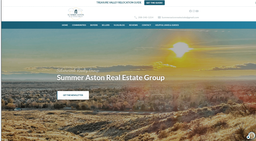
This simple yet effective landing page from Easy Agent PRO hits visitors with a stunning visual and a quick CTA of “Get the newsletter.” While minimalist, it appeals to the foundations of a successful landing page to bring buyer and seller candidates to the beginning of the sales funnel. And don’t forget, with Easy Agent PRO, you can create an unlimited number of neighborhood sites. This feature helps establish your credibility and improves your website rank in the top results for search engine optimization (SEO).
How to Create a Strong Real Estate Landing Page
Now that you have a better understanding of what a landing page is and ideas of what you want yours to look like, let’s talk about how to create a real estate landing page for yourself. To see success with your real estate agent landing page, you’ll need to offer something of immediate value to your visitors in a super-easy process. All they’ll have to do is provide their contact information to get your value-add item.
Strong Headline
The headline is the first thing visitors will see on your landing page. It should be simple, direct, and short. It is one or two concise sentences (see what I’m doing here?). The font and colors should stand out from the page and be exceptionally legible. The goal is for visitors to know what you are offering and be enticed to click on that offer. That way, you’ll have generated a lead for yourself.
Here are some examples:
- Join Our Newsletters
- How Much Is Your Home Worth?
- Get Our Free Homebuying Guide
- Find a Home You Love
- Sell Your Home Fast

Pro tip: When you’re writing your headlines and landing page copy, make sure to pay attention to the words you’re writing. The words should appeal to the audience that you intend to capture by using proper keywords and search engine optimization (SEO) tactics.
Call to Action
A call to action (CTA) is a statement and typically a button on your page that directs visitors to the item you’re offering. Similar to the headline, it should be kept short, have bold colors, and give an obvious directive to your landing page visitor. When people click this link, they will be prompted to complete a lead capture form. Choose from some of these CTAs:
- Get in touch
- Get an estimate
- Sign up today
- Get my free offer
- Sell with us
- Send me a newsletter
- Schedule a tour

Lead Capture Form
Everything you’ve done so far has led to your lead capture form. This is the most important piece of the landing page real estate puzzle because it moves website visitors into your sales funnel. The form should contain all the pertinent information you need to contact the person on the other side of the screen. This includes someone’s name, email address, and phone number. However, you can also include more options to learn about your visitors.
- Radio buttons asking someone is a buyer or seller
- Message box to add a personal question
- Drop-down with a preferred method of communication (email, phone, text, etc.)
- Checkboxes asking how far they are in their home search or sale (Just started, saw a few houses, have been working with an agent, lost one offer, etc.)
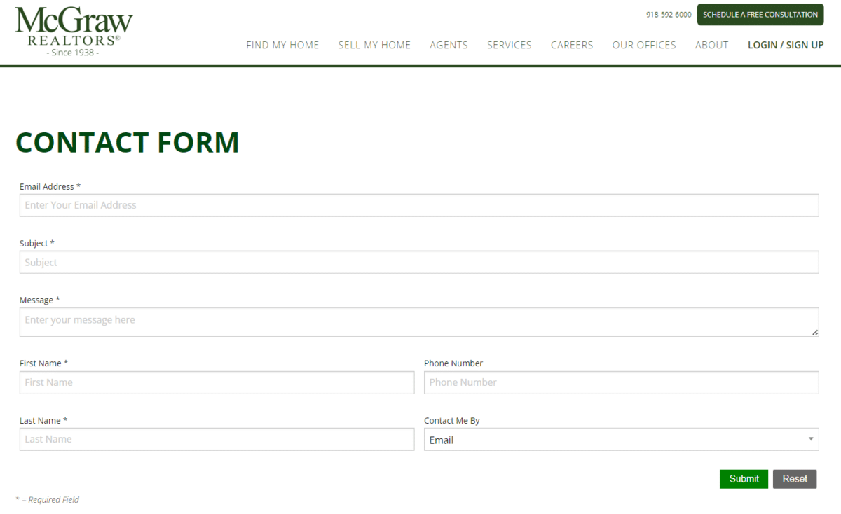
Keep in mind that you want the form on your real estate landing pages to be as easy as possible so that visitors aren’t deterred from completing it. According to Email Vendor Selection, the landing page conversion rate is 10% when you ask for three pieces of information. Even though it’s tempting to include all of the above information in your form, be selective and pick only what is necessary to move your leads forward in this process.
Value Proposition
While your ultimate goal is to snag contact information, you must provide value to website visitors in exchange. This value proposition can be anything from e-books to free consultations. Still, it has to work in the favor of your target audience, whether they’re buyers, sellers, investors, renters, etc. Here are some ideas:
- Free home valuation or comparative market analysis
- E-book about the homebuying or selling process, home staging tips, templates for investors, etc.
- Listings and property information
- Free marketing materials like flyers and brochures
- Virtual meet-and-greet
No matter which you choose, it has to be enticing enough for visitors to willingly give up their information (with the assumption you will use it to contact them).
High-quality Images
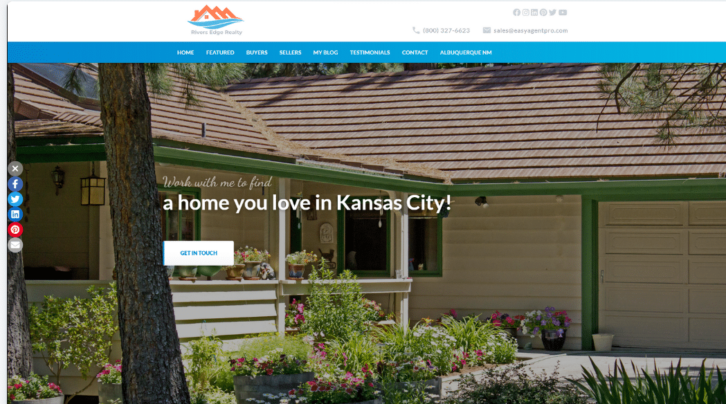
Your visuals are crucial because you only have a few seconds to grab a visitor’s attention. For a real estate landing page, high-quality images representing the neighborhood, the type of properties, or your marketing location could be the difference between a visitor and a lead. These images should capture the area’s essence—appeal to your ideal client and help them create an emotional connection that encourages them to engage with your landing page.
Mobile Experience
Optimizing your landing page for mobile users is non-negotiable. According to the National Association of Realtors (NAR), 76% of homebuyers used a mobile or tablet search device in their home search. With such a large portion of web traffic coming from mobile users, your landing page needs to focus on two essential things: 1) it should load quickly, and 2) your landing page should look great on all screen sizes. Before publishing your site, preview the mobile experience and ensure it’s easy to navigate and looks amazing.
A/B Testing
A/B testing is an invaluable way to improve the performance of your landing page over time.
To do this, experiment with different elements, change the number of fields in your lead capture form, and continually tweak the performance of your CTA buttons. Does a red button or a green button do better? How about filling out three forms vs four? Perform the tests and take the data to improve your landing pages through ongoing optimization.
FAQs
Are landing pages for real estate still a thing?
This lead generation strategy takes time, money, and effort. However, a great landing page can become a pillar of your business when done right. If you’re ready to take the next step, ensure you’ve researched and secured a way to nurture and convert these leads. Some providers we’ve listed above include a CRM and other nurturing tools. If you’re not using a CRM, that should be your first step. If you need help deciding on one, we’ve deep-dived into the best CRMs for real estate in 2024.
Do I need a professional web designer to set up a landing page?
Not necessarily. The landing page providers in this article offer easy-to-use templates and expert support. Setting up a landing page with them can be as easy as inputting an MLS number to an existing website domain address and creating a form to collect contact information.
We like the providers listed here because, while they give you a lot of control and creative license, they realize most agents don’t have time to be web developers and real estate experts!
How much should a landing page cost?
This cost all depends on the platform you use. Some website builders include landing pages in their packages, while others offer them as an extra add-on. For example, Placester’s Do it For Me Package includes landing pages in its $119 per month fee. AgentFire offers a website builder for $129 per month, with a home valuation landing page tool for an additional $39 per month.
What is a squeeze page in real estate?
Have you been to a site that’s advertising a specific product? For example, you click a social media ad for a webinar, an e-book, a course, or a subscription. Then, you’re sent to a very specific page for that item.
Squeeze pages are designed to sell one specific item. They’re full of copywriting and CTAs and don’t make leaving or navigating elsewhere very easy. However, they’re very effective for collecting information. Squeeze pages are a great way to do that if you’re considering incorporating webinars and education into your lead generation tactics.
How do I drive traffic to my landing page?
Driving free traffic is as simple as sharing the URL that leads to your landing page with prospects. Post the page on social media or add a link to it in your email signature. You can also try adding a button to your landing page somewhere on your website. This approach takes time, a commitment to best practices, and consistency.
If you want to look at paid options, consider purchasing Google or social media ads. Some website platforms, such as Luxury Presence, offer marketing integration as part of their suite of solutions.
Bringing It All Together
Have you succeeded with a real estate lead generation strategy that includes landing pages? Do you have a genius strategy for converting traffic into clients? Still have questions about landing pages? Let us know in the comment section below.


