One of the first things new agents and buyers realize is that bad real estate photos are everywhere. And in the real estate industry, there is nothing worse than making a bad first impression. I researched the interwebs to gather the worst of the worst real estate listing photos for your viewing “enjoyment.” I also gathered some expert tips and advice on staging and photography so you can ensure your listing photos never end up here!
Photography Fails
1. House Flipping?
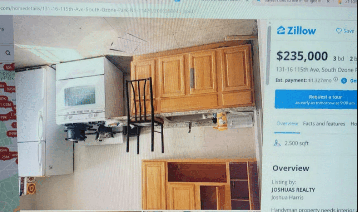
Why it’s bad: The photo was uploaded to his MLS without verifying the photos were in the upright position.
Fix: When adding photos to your listings, make sure you get them uploaded correctly before you push that publish button.
2. Virtual Staging Gone Rogue
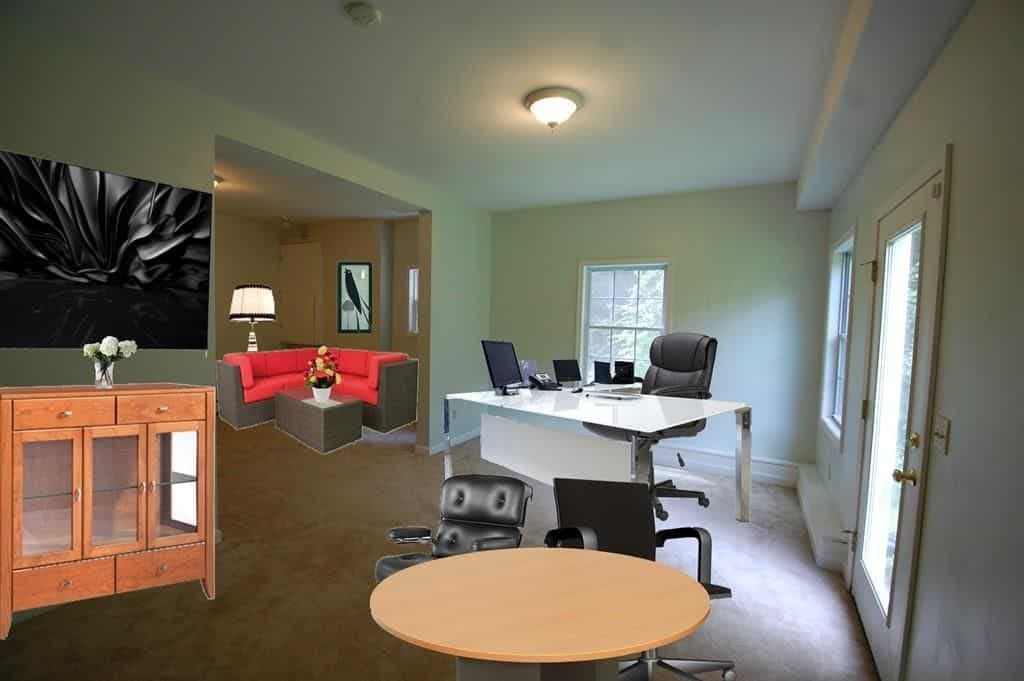
Why it’s bad: if you’re looking for weird real estate photos, virtual staging is the ticket. The virtual staging in this photo obviously was not done by a professional and looks that way.
Fix: If you want to use virtual staging, use a professional company like Apply Design to make sure it looks realistic. And make sure your photos are well-lit, professional photos before you add virtual staging.
Pro Tip: Get results like THIS 👇 for just $7 per photo.
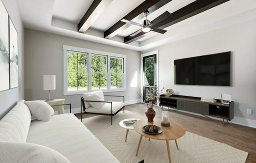
With virtual staging companies charging $30 to $100 per picture these days, most agents only use them for luxury listings. Sure, there is DIY staging software out there, but most are a pain to use, and the quality is awful. That is until Apply Design came along.
Apply Design is the first DIY virtual staging software that is easy to use, easy to get professional-looking results from, and, best of all, affordable enough for any agent. They even have a 100% money-back guarantee, and you can stage your first room for free.
3. Blurred Lines
Why it’s bad: This photo is so blurry it’s unrecognizable. It looks like it was blurred for the protection of the seller.
Fix: When adding photos to your listings, don’t upload any photos that are so low quality that no one can see them.
4. A Fracture in Space
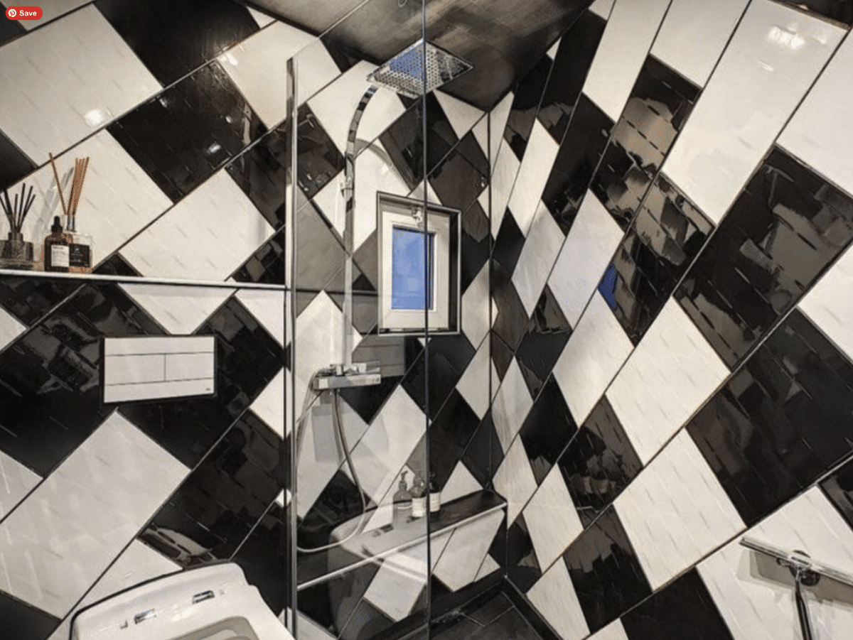
Why it’s bad: It’s difficult to make out exactly what’s going on in this photo. Is it a portal in the space-time continuum? Hard to say for sure.
Fix: This photo could use a little context. Reflections in the glass are creating a bizarre effect that could really throw off potential buyers. Get more of this room in the lens.
5. Rex Discovers a Portal to Another Dimension
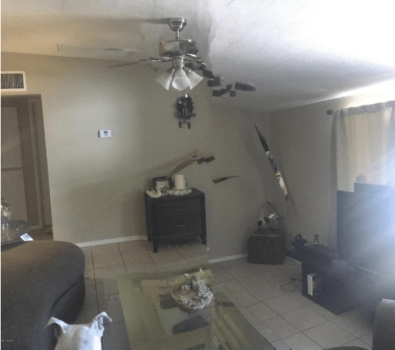
Why it’s bad: Aside from the fracturing of the space-time continuum, there probably shouldn’t be a dog’s head in the photo.
Fix: This is more careless than anything else. If your photo looks like this, take another one while holding the camera still long enough for it to finish collecting the image.
6. My Selfie Stick Makes This Easy
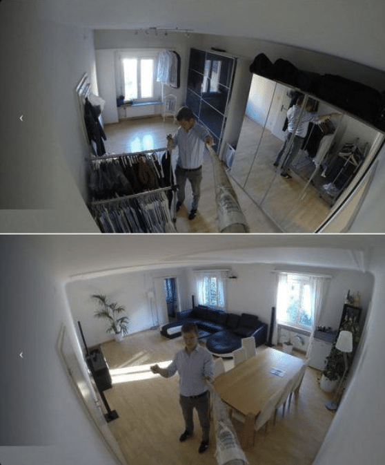
Why it’s bad: Just what everyone wanted to see—your head in front of the sofa.
Fix: OK, I’m going to be blunt—if you don’t know how to use these properly, please don’t. It’s called a selfie stick because it puts you in the picture. You don’t need to be in any of the listing pictures, so just don’t.
Staging and Decor Disasters
7. Living Inside a 90s Taco Bell
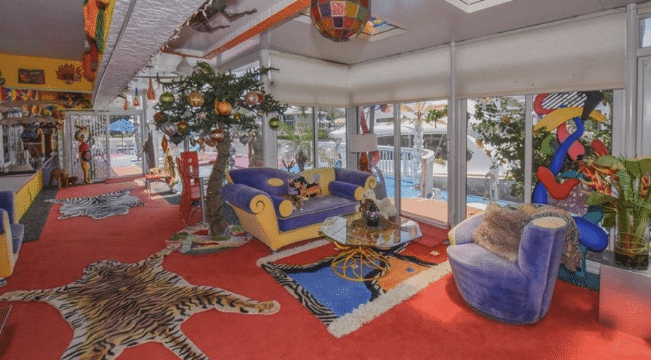
Why it’s bad: This room is filled with color—so much so that a potential buyer might be overwhelmed and miss the features of this home.
Fix: Your sellers don’t have to do a complete overhaul of their home for it to sell. But you can use your knowledge of home staging basics and help them cut down on some of the clutter to minimize the sensory overload.
8. Eat More Chicken
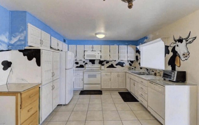
Why it’s bad: Let’s just be honest—everyone has their weird kinks, and that’s perfectly fine. But when it’s time to sell, you probably don’t want to advertise those kinks to the whole internet.
Fix: Before you list a new property on the MLS, you might encourage your sellers to invest in some paint to get the home back to a more neutral tone.
9. The Corpse Dino
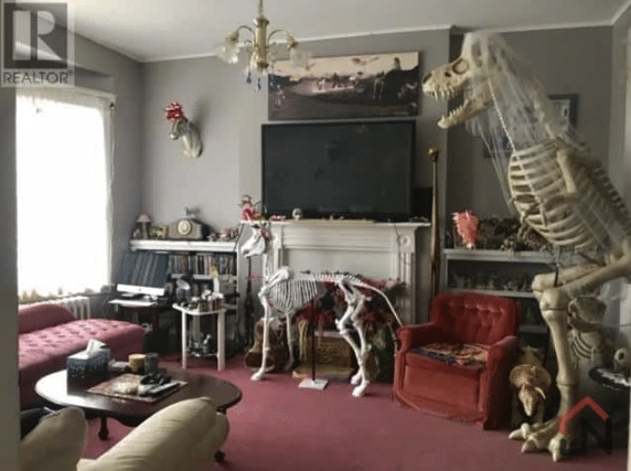
Why it’s bad: Again, we all have our idiosyncrasies and bizarre hobbies. But there’s no need to broadcast them to the world.
Fix: As an agent, when you tour a room like this with your sellers, you should look at it as the perfect opportunity to discuss what “declutter” means.
10. Grecian Sanctuary
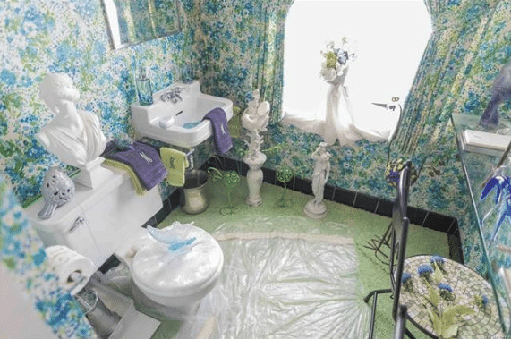
Why it’s bad: You have to wonder how they get the toilet lid to stay open if they need to sit down. And just how bad is someone’s aim if you need that much plastic on the floor?
Fix: Sure, this is just another example of DIY home design gone wild. But you can coach your sellers to remove some of the extra, including the plastic sheet on the floor before picture day.
11. Too Many Options
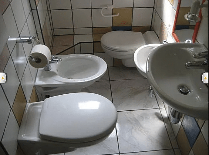
Why it’s bad: It’s great to have options when using a washroom, but this one is actually overwhelming. Why are there two (or is it three) toilets? And only one roll of toilet paper?
Fix: The angle on this image does not do this bathroom any favors.
12. Zero Gravity
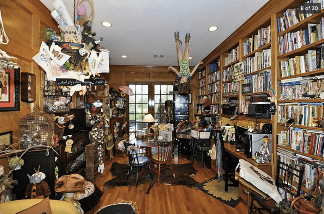
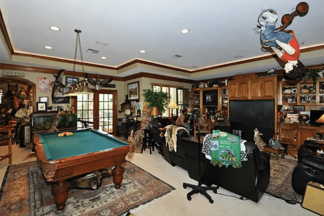
Why it’s bad: This listing definitely deserved two images. First, it’s a million-dollar listing, but it’s also one of the most cluttered homes ever. There is a mannequin hanging from the ceiling in not one but two separate images. The realtor said the buyer of this home would be able to see the forest through the trees. 🤷♀️ Seriously, this whole listing is chock full of funny real estate photos that will have you scratching your head.
Fix: It’s important to help your sellers understand the importance of depersonalization. Please have this conversation with them.
13. It’s About Damn Lime
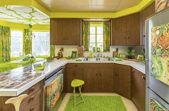
Why it’s bad: In a minute, I’mma need a bucket o’paint! I had a listing for a room painted this color once. No buyers could get past it.
Fix: I can’t tell you how many buyers said, “Just show us—we can look past [insert bad house feature here],” but then balked when I showed them the home. Don’t believe your buyers. Don’t show homes that are not show-ready. But when you do, use virtual staging to show buyers how a little paint can work some magic.
14. Under the Sea
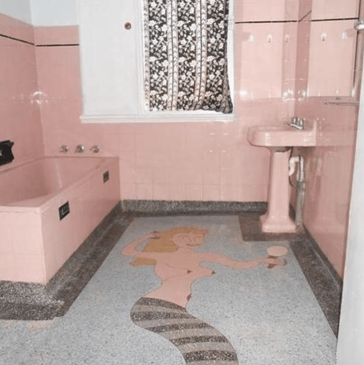
Why it’s bad: There’s just no accounting for people’s taste. But that doesn’t mean you have to put it on display.
Fix: No doubt about it, this floor needs some creative photography best left to the pros. And quite possibly a flooring allowance.
15. Just Add Glitter
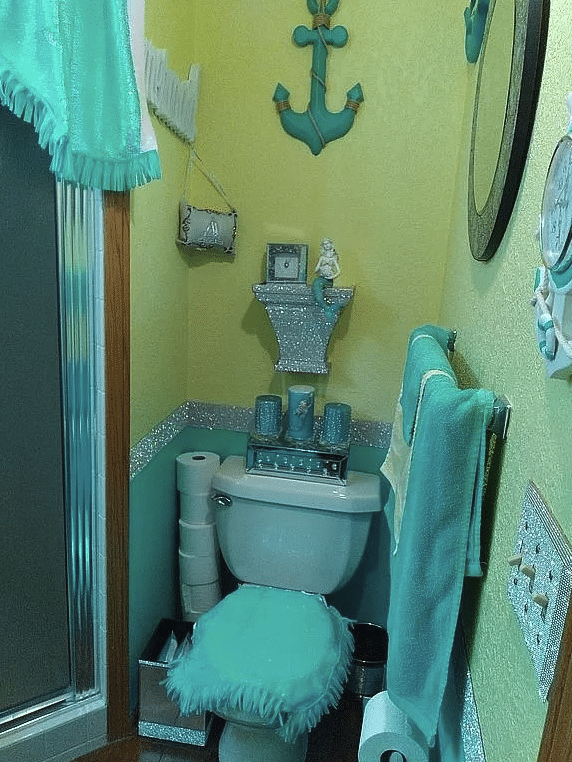
Why it’s bad: This bathroom definitely needs more sparkle … and a toilet paper roll holder!
Fix: There’s so much color in this tiny bathroom. Certain colors can make a space feel even smaller, while others can help open up a tight space. You might encourage your sellers to paint this bathroom a color that adds some area.
16. Some Like It Ugly
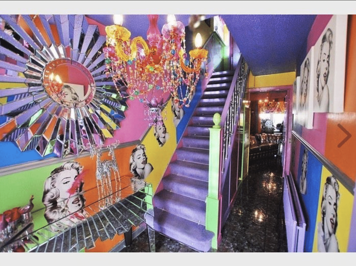
Why it’s bad: Are you listing a funhouse? There are so many colors! It may be a lot to ask your sellers to remove all the clutter and repaint.
Fix: It may be a lot to ask your sellers to remove all the clutter and repaint the house, but you should definitely give it one helluva try. Or at least consider some virtual staging and a paint allowance.
Unexpected Occupants
17. Send in the Clowns
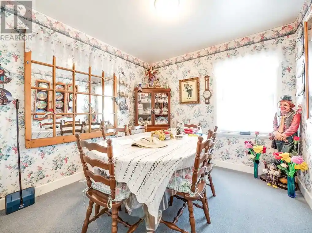
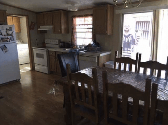
Why it’s bad: There is a lot going on in this image, not the least of which is the 4 ft. clown statue in the corner. Some of the most awful real estate photos feature really creepy clowns.
Fix: Have thorough conversations about neutralizing the home to provide potential buyers with fewer distractions.
18. Life on the Serengeti

Why it’s bad: You’ll notice there are many images on this list with a lot going on, like this photo filled with taxidermy from exotic lands.
Fix: Sit your sellers down and encourage them (strongly) to minimize the clutter in the home. Offer to help them find a storage location to house their many prized possessions that might detract from buyers focusing on the home rather than their collection.
19. Master of Multitasking
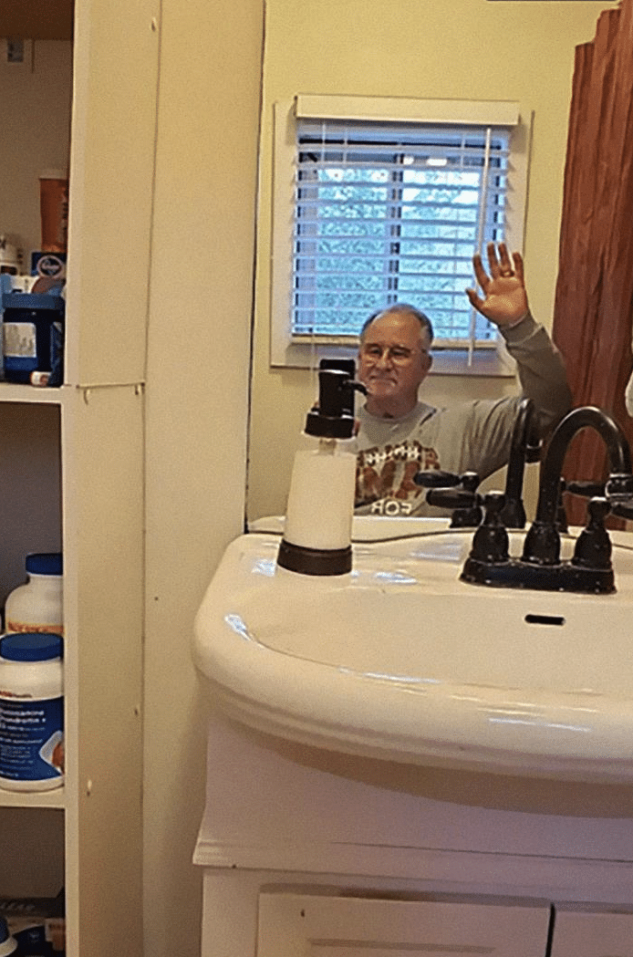
Why it’s bad: Clearly, this seller is a DIY type, based on this terrible real estate photography.
Fix: Your MLS photos should not have anyone in them, especially if they’re actually sitting on the toilet. Pop for some professional photos to make sure the job’s done right.
20. Mane Entry
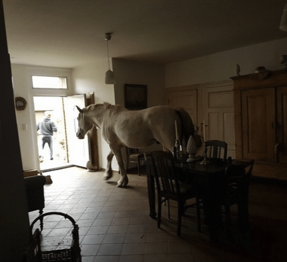
Why it’s bad: Why would anyone snap a photo before the horse was out of the way?
Fix: Photography for your listing should not be taken so carelessly. Plan out your photo shoot, make sure you have great lighting in every room, and clean up any extraneous items so your photos are clean and show the home in its best possible light.
21. Holy Cow!
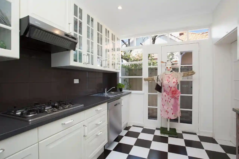
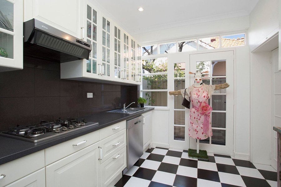
Why it’s bad: How lonely do you need to be to install this oddly well-dressed, life-sized creature in your home? And why is it there for photos?
Fix: It’s highly recommended to be present when your listing is scheduled for photos. Perhaps if this agent had been present, they could have moved Mrs. Heifer to the other room while this pic was taken.
22. Photo Bomb
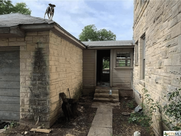
Why it’s bad: Sure, dogs are amazing, and no one loves them more than I do. But this dog takes the cake! How in the hell did he even get up there?
Fix: As cute as this little guy is, he’s just another distraction taking away from the house. When taking photos, make sure you don’t accidentally capture a lovable mutt in the frame. And I suppose you should look up as well.
Structural and Design Oddities
23. M.C. Escher Fanboy Homebuilder
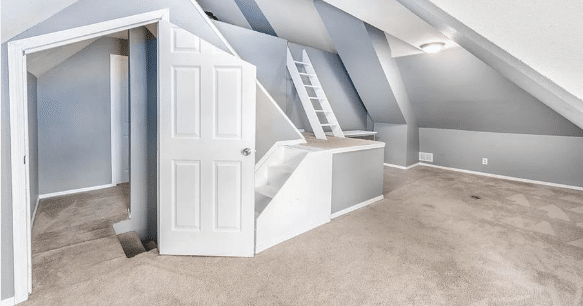
Why it’s bad: The photo isn’t the problem here; it’s the home itself. (Where are all those steps going?)
Fix: Every home you list won’t be magazine-worthy. All you can do is make the best of what you’re working with. Treat every listing equally, and make sure you’re doing all you can to showcase the best features. Find clever ways to highlight the positives!
24. Bed, Bath, and Be-gross!
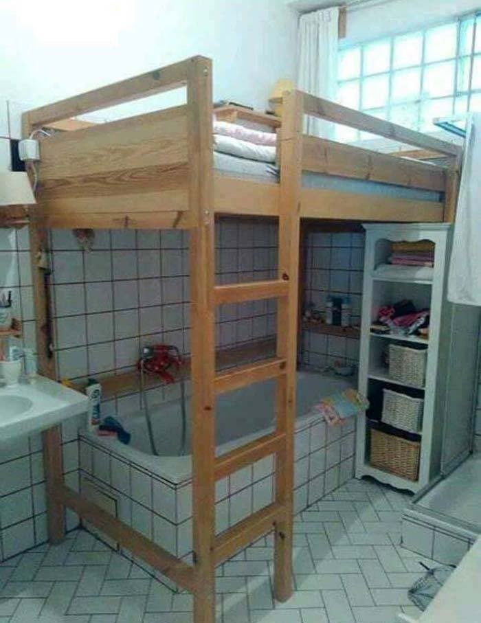
Why it’s bad: It’s hard to know where to begin with this photo, but it will probably be the bunk bed over the tub.
Fix: If you absolutely must list a photo like this, at least make sure it’s tidy. And you should probably get creative with your listing description.
25. I Can Really See Myself Living Here
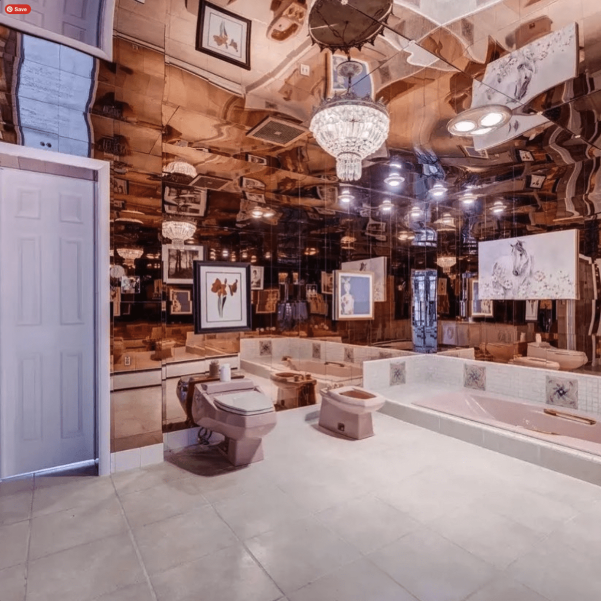
Why it’s bad: Why anyone would want to see an infinite number of themselves on the toilet or naked in the tub is beyond me. Anything with this many mirrors ranks up there with bad real estate pictures that you probably can’t fix.
Fix: Hire a professional photographer. Hopefully, they’ll have a few creative ways to shoot this room to tamp down the effects of all those mirrors.
26. Outdoor Facilities
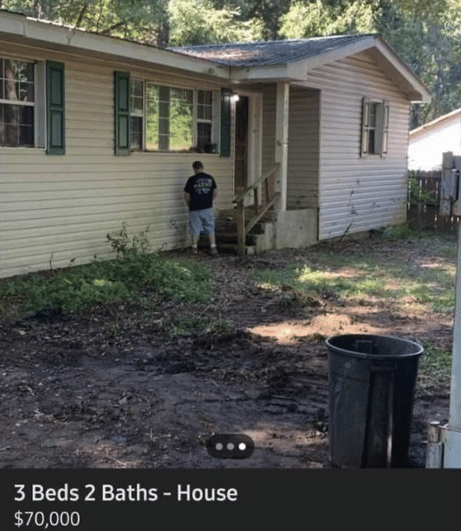
Why it’s bad: No matter how you look at this photo, it’s not showing anything positive about the house.
Fix: For the love of all that’s holy, please don’t take a picture of the house with someone taking a piss right on the side of it! Just no.
27. For Emergency Evacuations Please Use Stairs
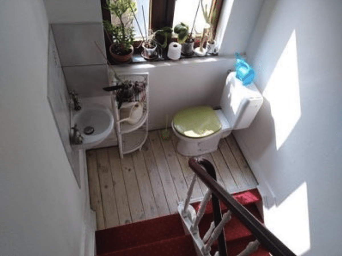
Why it’s bad: Not sure who thought this was a good place to install a bathroom, but here we are.
Fix: Because of the refracted lighting, the toilet is overexposed while the corner with the sink is dark. Make sure your lighting is balanced, or correct it in post.
28. Fertility Window
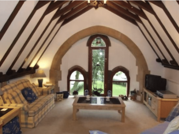
Why it’s bad: This home’s unique structural design conjures intriguing thoughts. Amirite?
Fix: When your listing has unfortunate features, the best way to offset them is to get images from different angles that de-emphasize the issues. Best left to the pros.
Cleanliness and Clutter Issues
29. Where’s the Remote?
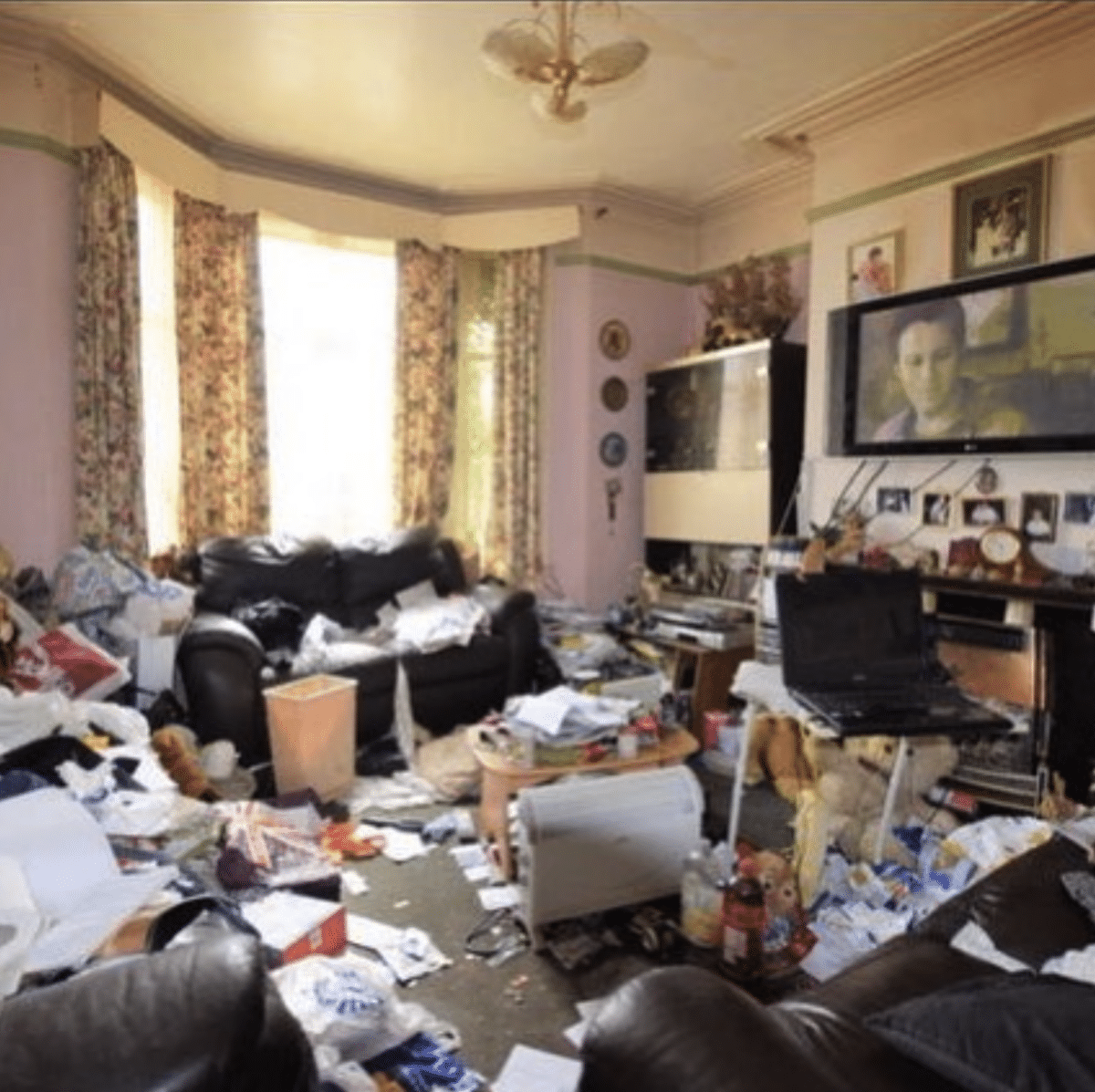
Why it’s bad: Let’s face it—not all of your sellers are going to be the cleanest. But you should not broadcast that information to the entire internet.
Fix: This is the perfect situation where you will benefit immensely from offering to pay for a cleaning service for your sellers.
30. This is Where I Like to Go to Cry
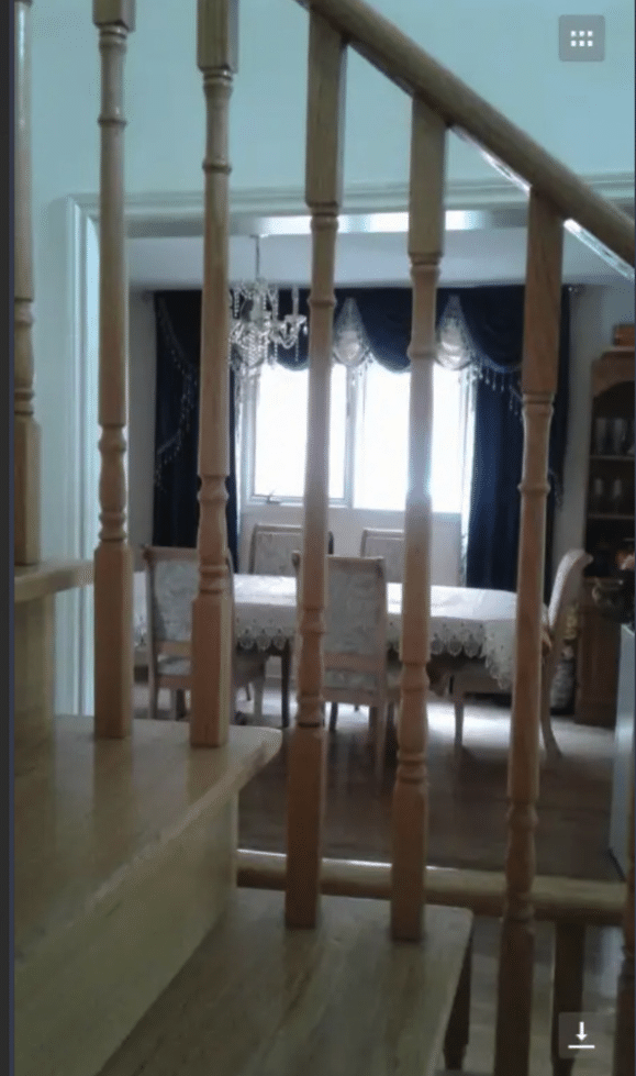
Why it’s bad: Listing photos should give viewers a feel for what it’s like inside the home while showing off its best features. Not sure if this one gives that vibe.
Fix: When shooting photos and videos of your listing, don’t let obstructions get between your viewer’s eyeballs and the space.
31. Elder Enclosure

Why it’s bad: To be completely honest, I’m not sure why this pic would even make it to your actual listing.
Fix: When choosing images for your listing, it’s important to ask yourself, “Will this photo help me sell this house?”
Inappropriate or Bizarre Content
32. Fire Sale

Why it’s bad: I don’t know where to start. An image of a home on fire in the MLS? That’s got to be up there among the most terrible real estate pictures ever, right?
Fix: Listing photos should highlight the home’s best features. Show your listing in its best light.
Fix: When adding photos to your listings, don’t upload any photos that are so low quality that no one can see them.
33. No Realtor Needed
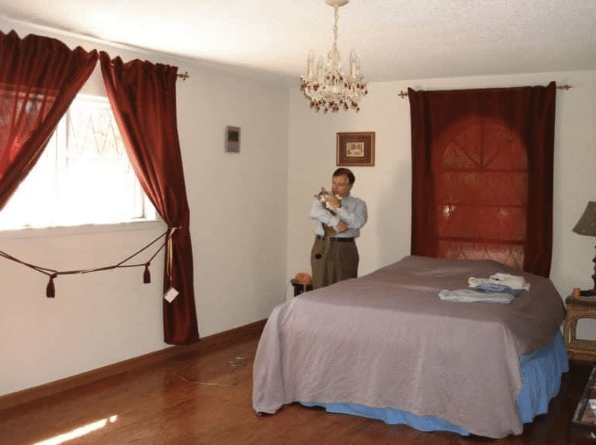
Why it’s bad: Anything that detracts from the home’s features should be eliminated.Fix: This is what happens when sellers think they can sell their home as easily as any agent. Check out the Zillow FSBO listings, and you’ll find a veritable gold mine of sellers out there who desperately need your expertise.
Pro Tip: Spend a few minutes scrolling through any FSBO site, including the FSBOs on Zillow, and you’ll learn just how horrible 99% of FSBO marketing is. When you finish scrolling (and laughing), our best FSBO scripts article will be waiting for you.
34. Valley of the Dolls
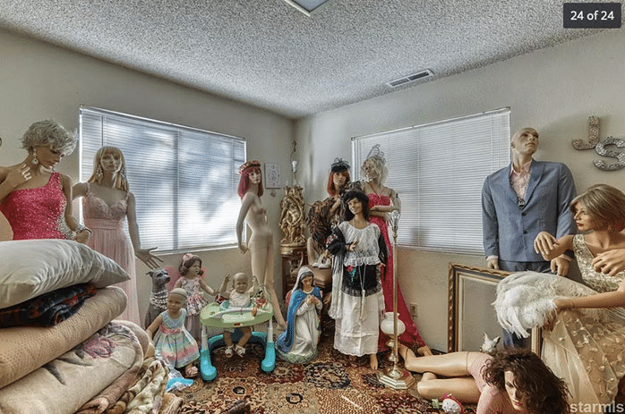
Why it’s bad: It’s the one lying on the ground like she’s in a 90s music video for me.
Fix: Again, when there’s so much stuff in a room that it distracts the buyer from the home’s features, it needs to go. Help your sellers find temporary storage for their bizarre collections.
35. Percy Jackson
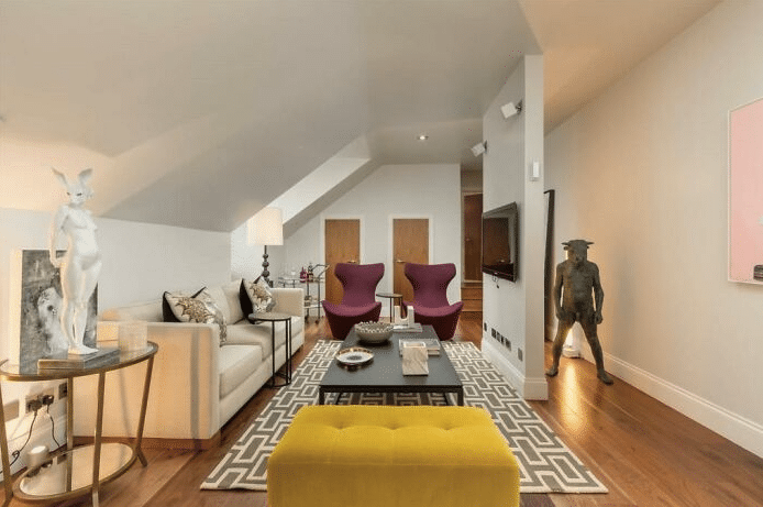
Why it’s bad: This house is really gorgeous. The female rabbit statue is a little questionable, but the minotaur in the hallway is haunting my dreams!
Fix: Any potential buyers would naturally be scared away if they saw this image in the MLS. Stage the home tastefully and remove distractions like this monstrosity.
36. It’s a Jungle out There

Why it’s bad: Now might be a great time to discuss curb appeal.
Fix: As a listing agent, you’ll want to make sure this doesn’t happen to your listing. Hire a landscaper to keep the jungle trimmed and neat.
37. Target 🎯 Your Audience
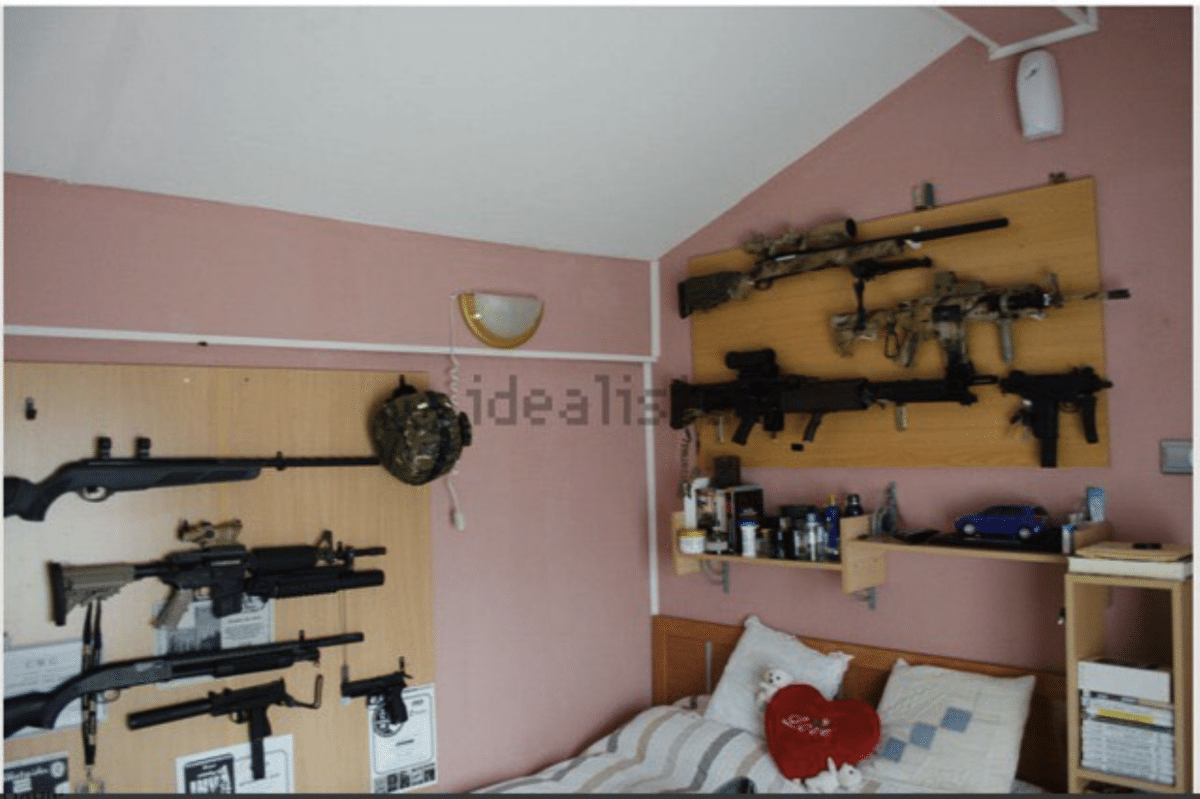
Why it’s bad: Do I really need to explain why this photo might turn off buyers?
Fix: Humans are interesting, with lots of interesting hobbies. But maybe some things should only be known by those closest to you. Pack up the gun collection for pictures and showings, just to be on the safe side.
38. This Could Have Been So Much Worse
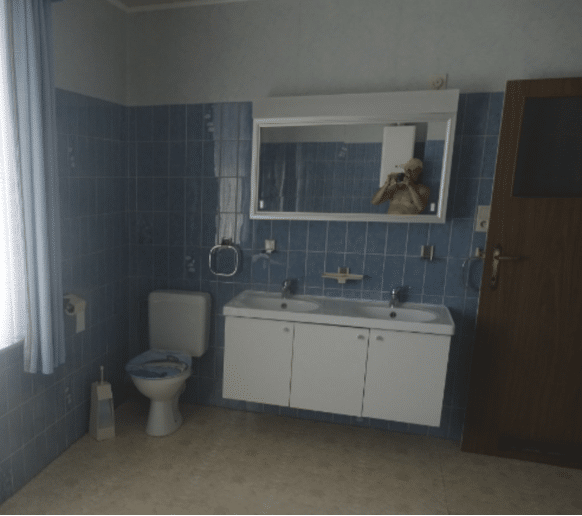
Why it’s bad: It would be kind of funny if it wasn’t so horrifying at the same time.
Fix: Don’t have your naked seller take photos of your listing. Not to mention, the lighting in this bathroom is really bad.
39. Stunning Art
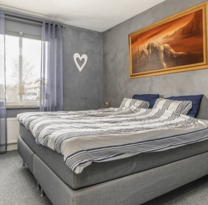
Why it’s bad: The lighting is good, the bed is made, what could possibly…??? Oh, that!
Fix: I’m all for embracing sexual exploration. But when you put your house on the market, you might want to tone down anything that could embarrass buyers who come through your home. They’ll be so stunned, they’ll walk away from your listing without any further consideration.
40. Lifestyle Goals
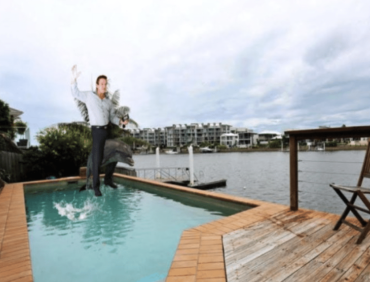
Why it’s bad: This photo is a blatant abuse of Photoshop and really bad graphic design and should be avoided at all costs.
Fix: In all seriousness, what exactly does this photo have to do with this house? That pool certainly doesn’t come with its own dolphin-riding agent. It’s just silliness.
41. Slow Market
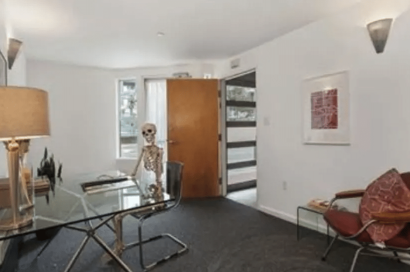
Why it’s bad: “What’s your average number of days on the market for listings?”
Fix: You gotta love people’s senses of humor. While this skeleton will make some people laugh, it could also upset others. It’s best not to use the MLS for your (or your seller’s) practical jokes.
42. Thoughtful Closing Gift
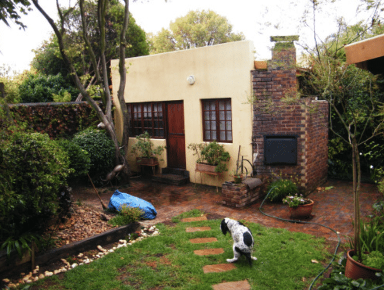
Why it’s bad: This would be a perfectly lovely image of this little cottage if only Baxter had gone earlier when we made that stop.
Fix: I feel like a broken record, but listing photos should not be some offhanded thing you do just as you’re leaving the property. Make sure your images are free from distractions (and debris).
43. Stock Photo
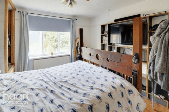
Why it’s bad: It’s the juxtaposition of the stockade footboard, complete with leg restraints, against the Stitch-themed bedspread for me.
Fix: If you come across a situation where too much of your sellers’ sex life is on display, you might try to find creative ways to disguise it. For example, I may have removed the leg restraints and covered the footboard with an afghan so it’s less obvious. Just my thoughts after staring at this photo for longer than I care to admit.
44. Too Intimate?
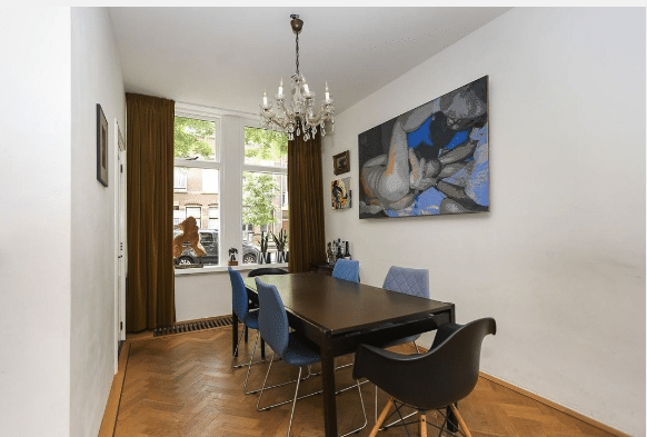
Why it’s bad: “The painting on the wall is custom art …”
Fix: Not everyone’s taste in art will be the same. For many, this intimate portrait of a birth may be off-putting. Best to remove it for photography and showings. Agree?
45. Nightmare Listing
Why it’s bad: Can you imagine seeing this as a potential buyer on the MLS? I mean, the lighting is atrocious!
Fix: But seriously, don’t be this agent. This photo is only causing serious anxiety for most of the viewers who encounter it. It does nothing to help sell the property.
How to Get the Most From Your Real Estate Photos (And Never End Up On This List!)
Look, I get it. Taking Instagram-worthy pictures of creepy and cluttered houses isn’t easy. But a listing is a listing, right? So if you want to actually sell the property, you’re going to have to do your best to present the house in its best light. And maybe not every listing needs professional photography, although that’s a debatable topic for another article. Here are six simple tips to take better pictures of visually challenged homes.
Tip 1: For the Love of All That Is Holy, Put the Toilet Seat Down!
One of the first things I learned from my professional real estate photographer is to put the toilet seats down before you snap those photos. My photographer went through the house and made sure they were all closed before he took even one photo. So, before you start clicking, go through the house and close all the toilet lids, regardless of everything else that might be wrong.
Tip 2: Offer to Pay for a Decluttering & Cleaning Service
A dirty house filled with junk is always going to be the last one buyers schedule a tour to see. That means your listing will sit on the market longer, and you might need to lower the price to get the house some love. So if your homeowner refuses to clean or move the Star Trek collection to the garage, consider paying out of pocket to get the job done.
Tip 3: You Don’t Need to Show the Weirdness
I’ve already touched on this, but everyone has their own weird things. But there are exactly zero reasons to upload pictures of your homeowner’s weird belongings to Zillow. Try to convince your sellers to move their personal stuff to a storage unit while you’re trying to sell the home. Offer to pay for a storage unit if you have to. But remind them of the objective—depersonalize so buyers can see themselves in the home, not the sellers.
Tip 4: Resist the Urge to Edit Your Own Pictures
Unless you’re a professional editor, editing your own listing pictures is never a good idea. It is absurdly easy to make a mediocre picture worse, and you can hire a professional editor for a small fee. So do yourself a favor and leave it to the pros. You’ll thank me later.
Tip 5: Use a Professional Virtual Staging Service or App
Be extremely careful with virtual staging. It’s so easy to overdo it and make your listing photos look ridiculous. Hire a professional or use a company that specializes in real estate virtual staging. Sure, it’s a little more expensive than professional photo editing, but it’s always a great investment when trying to get a challenging home sold. You have so many more options today, with more coming in the near future.
Tip 6: Learn the Basics of Photography
If you insist on taking your own pictures instead of hiring a photographer like every successful real estate agent, at least take a few hours to learn the basics. Professional real estate photography is not easy, but it’s also not as hard as you think it is. Check out our deep-dive guide on photography to learn how to take pictures that won’t end up on this list.
Bringing It All Together
Have some unbearably bad real estate photos to share or a real estate photography tip that works every time? Send it to us at hi@theclose.com or share it with us on Instagram via @theclosedotcom. Use the hashtag #realestatepictastrophes


