In today’s crazy competitive real estate market, that first impression is everything. And your real estate graphic design is often the first thing potential clients see, so it better be on point. But don’t stress because I’ve got your back. I’ve put together the ultimate guide to graphic design for realtors in 2024.
I’m talking logos, social media graphics, free stock photos, templates—the whole nine yards. I’m even diving into when to call in the pros and hire a designer. Oh, and did I mention the free Real Estate Branding Guide I’m throwing in? Yep, I’m giving you everything you need to create a brand that’s so good clients won’t be able to resist. So, let’s do this!
Why Graphic Design Matters for Real Estate
Your brand is way more than just a logo or website. It’s the whole package—everything that shapes how people perceive you and your business. The great news is that you have the power to guide their perception by creating a unique combination of messaging and visuals that’s all your own.
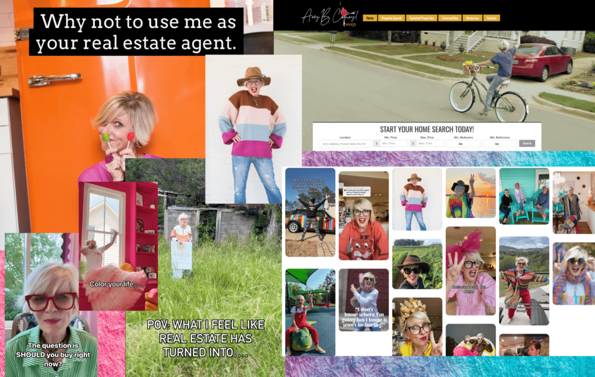
Whether we like it or not, potential clients form opinions about a property and the agent representing it based on the visual appeal of their real estate marketing materials. As a real estate agent in a transitioning market, standing out from the competition is critical. But, with the right branding strategy, you can showcase your personality, expertise, and what sets you apart. You can connect with your target audience and build trust before they meet you.
Branding is a powerful tool for your success, so take the time to develop a brand that truly represents you and your business. Watch as it helps you attract your ideal clients and close more deals. Trust me, it’s worth it!
Benefits of Graphic Design for Real Estate Agents
Whether you’re using DIY tools or paying a pro, your real estate business will benefit from high-quality graphic design. Don’t underestimate the power of branding. Spend time defining your style, colors, and the statement you want to make in the world. Great graphic design will create the following:
- Increased brand recognition and memorability
- Enhanced credibility and professionalism
- Improved communication of key information
- Higher engagement rates on marketing materials
- Competitive advantage in the market
As your brand becomes more visible, both online and offline, your business will attract more clients, and you’ll close more deals. So, don’t skimp on the design details of your brand right up front. Invest in high-quality real estate graphic design to gain the most benefit from your marketing strategy.
First, Establish Your Brand Identity
Without delving into branding, you can’t get too far into real estate graphic design. Now that you clearly understand why graphic design matters and its benefits, it’s time to start building your personal real estate brand identity.
Establishing the look and feel of your brand is a critical step in creating effective real estate marketing materials. Spend some time on each of these elements to develop a brand identity that aligns with your personality and professional goals.
- MVV: Your mission, vision, and values (MVV) are the core identity behind your brand and all marketing materials you produce. They will help guide you through most graphic design choices you make.
- Branding: Consistent branding is crucial for real estate agents. This includes using a specific color palette, font family, and logo across all marketing materials to create a recognizable and professional brand identity.
- Color psychology: Colors can evoke up to 90% of an initial impression. You should understand the basics of color psychology and use colors that create the desired mood and attract your target audience.
- Logo: Your real estate logo is the face of your brand and should be memorable, unique, and reflective of your brand’s values.
- Typography: Choosing the right fonts can significantly impact the readability and overall appeal of your designs. Choose legible and professional fonts that align with your brand’s personality.
Once you have established your brand’s color palette, typography, and logo usage, maintain consistency across all marketing materials, including business cards, property flyers, social media posts, and other marketing collateral. This will create a cohesive and recognizable brand identity.
Need a little more in-depth guidance on setting up your unique brand identity? Worry not! We’ve got you covered. You can download our Real Estate Branding Guide and go deeper into all the details of developing a brand that represents you and resonates with your audience. Check it out!
DOWNLOAD YOUR REAL ESTATE BRANDING GUIDE
DIY Design Tips for Real Estate Agents
You may not be a pro real estate graphic designer. Still, you can certainly learn a few design tips to help create stunning images for consistent social media posts, email marketing, real estate infographics, postcards and flyers, and more to keep your brand identity consistent no matter what you need to create.
Tip 1: Use White Space Effectively
White space, or negative space, is the empty space between all your design elements. It’s like the secret sauce to making your designs look clean, organized, and easy on the eyes. Don’t be afraid to give your elements some breathing room.
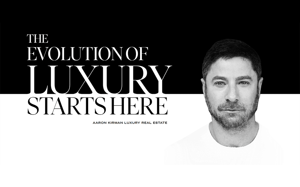
Tip 2: Create Visual Hierarchies
This is just a fancy way of saying you should arrange your design elements in order of importance. Use size, color, and placement to first guide your viewer’s eye to the most critical information. Make those headlines and key details pop by using larger or bolder fonts to draw attention to them. Use subheadings, bullet points, or numbered lists to break up text and make it more scannable.
Tip 3: Use Contrasting Colors
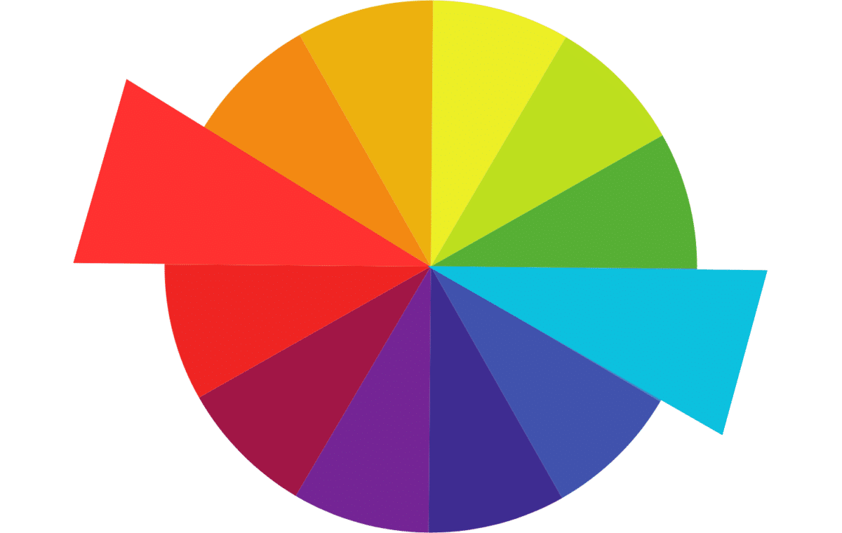
Using contrasting colors can make important elements stand out, like a neon sign. Use a color wheel to find complementary colors for maximum impact, choosing colors from the opposite side of the wheel. Just make sure your text is still legible—you don’t want people squinting while trying to read your graphics. But caution: use contrast sparingly. The last thing you want is to overwhelm the design and your reader. Focus on highlighting the most important elements.
Tip 4: Align Elements Consistently
Alignment is key to creating a polished, professional look. Use a grid system to keep everything in line. Make sure related elements, like text and images, are aligned to create a cohesive look. Consistent alignment makes your designs look polished and easier to read.
Tip 5: Embrace Simplicity
When in doubt, keep it simple. Stick to a limited color palette and font family for a put-together vibe. Avoid going overboard with decorative elements or busy backgrounds that can distract from your main message. Focus on delivering key information with clarity. Never sacrifice your message for a pretty design.
Tip 6: Use High-quality Images
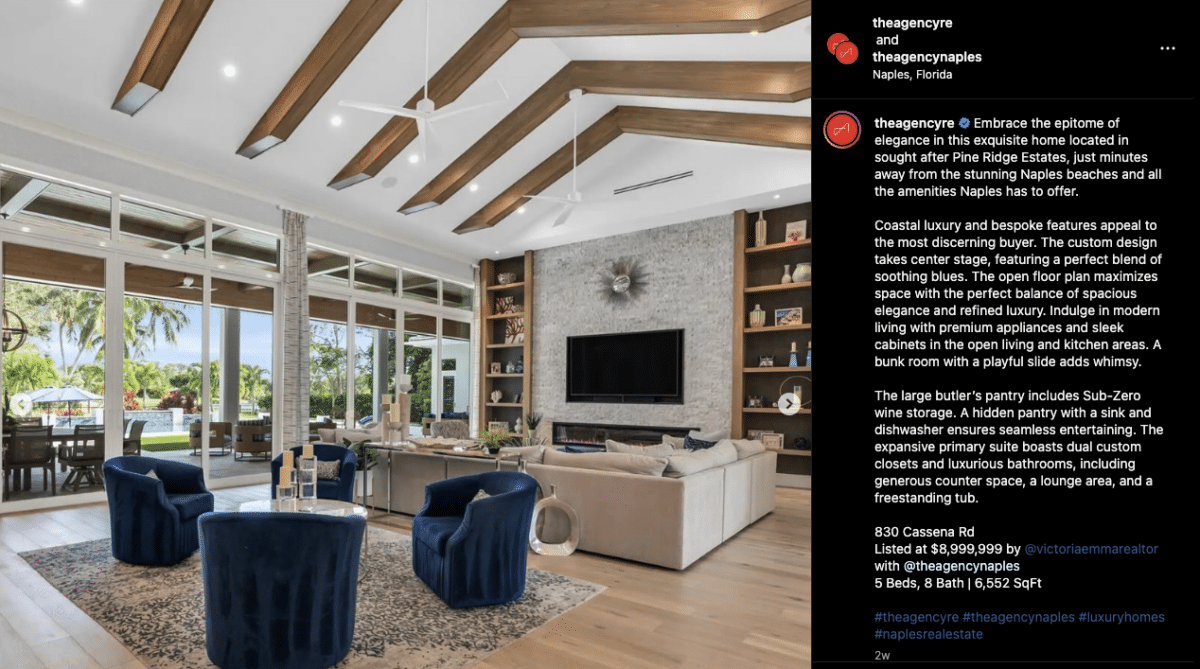
There’s no excuse for not using high-quality images in your real estate graphic designs. Use professional, well-lit photos that show off a property’s best features. Make sure your images are sized and optimized for their intended use, whether digital or print. If you’re using stock photos, choose ones that look authentic and relate to your message.
Tip 7: Be Unique
It’s great to get inspo from other successful agents and see what design elements really catch your eye. But here’s the thing—don’t just copy and paste. Get inspired, but then create something that’s uniquely you. Put your own spin on it and let your personality shine through. That’s what will really make you stand out from the competition.
DIY Design Tools for Real Estate Agents
Ready to get started designing your stunning real estate graphics? I’ve pulled together a list of some of the coolest DIY marketing design tools to get you started.
| Design Tool | Monthly Price | Best For | Usability |
|---|---|---|---|
| Canva | Free to $10 (paid annually) | Social media, postcards, flyers, printed marketing materials, templates | Easy |
| Agent Crate | $29 | Social media, reels, content marketing, templates | Easy |
| Vista Create | Free to $10 | Social media, printed marketing materials, templates | Easy |
| Adobe Creative Cloud | $9.99–$52.99 | Suite of graphic design tools, including Photoshop, Illustrator, and Adobe Express* | Difficult |
| Coffee & Contracts | $45 (paid annually) | Social media, reels, content marketing, Broke Agent memes, templates | Easy |
| Tailor Brands | $3.99–$12.99 (paid annually) | Free logo creator, website design, social media templates | Easy |
| LCA Marketing Center | $59 | Print materials, social media, email marketing, newsletters, templates | Easy |
| Unsplash | Free | Royalty-free high-definition stock photos and B-roll video to use in your marketing (online and print) | Easy |
| Envato Elements | $16.50 | High-end creative assets, including video templates, audio, royalty-free music, fonts, sound effects | Moderate |
| Genial.ly | Free to $20.82 | Animated graphics to use in social media, websites, presentations, etc. Check out this example | Moderate |
| *Adobe Express offers a free version with basic editing tools and limited assets. | |||
Real Estate Graphic Design Templates
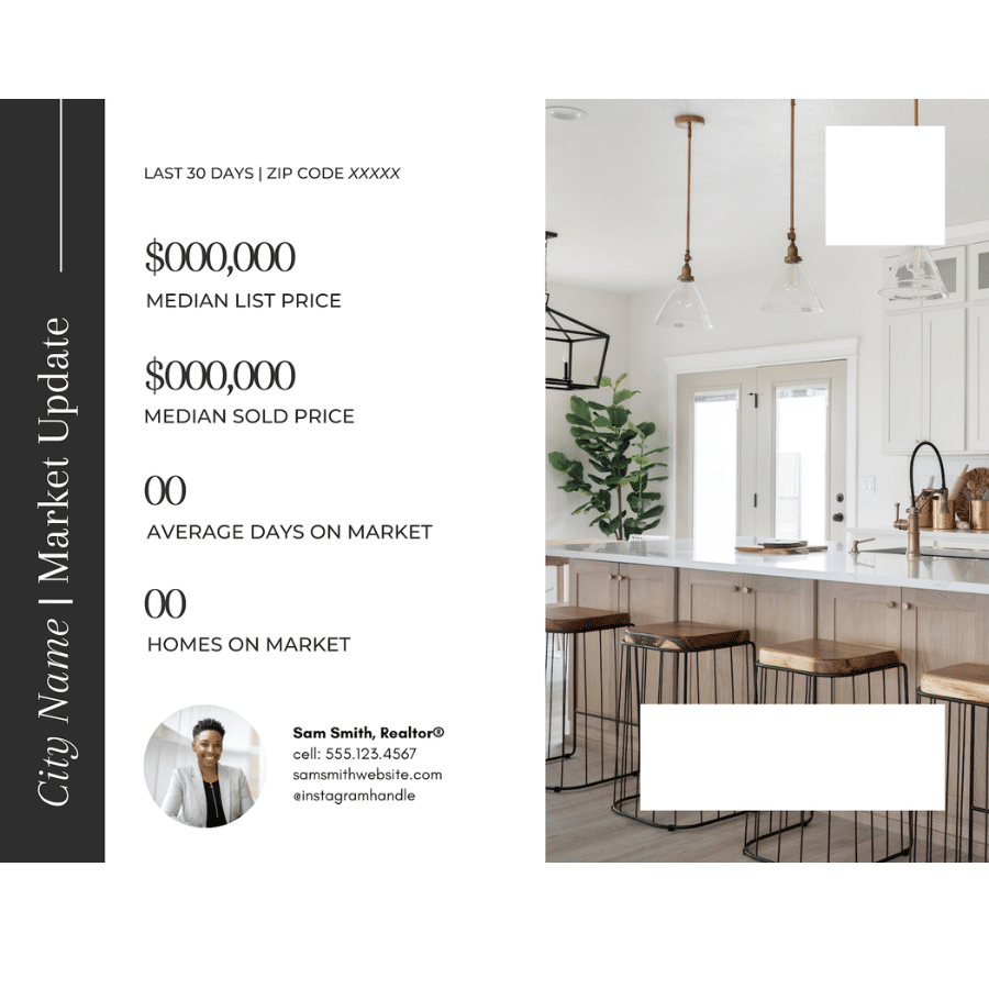
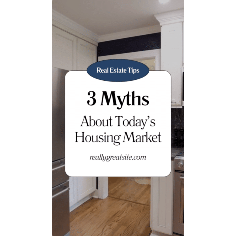
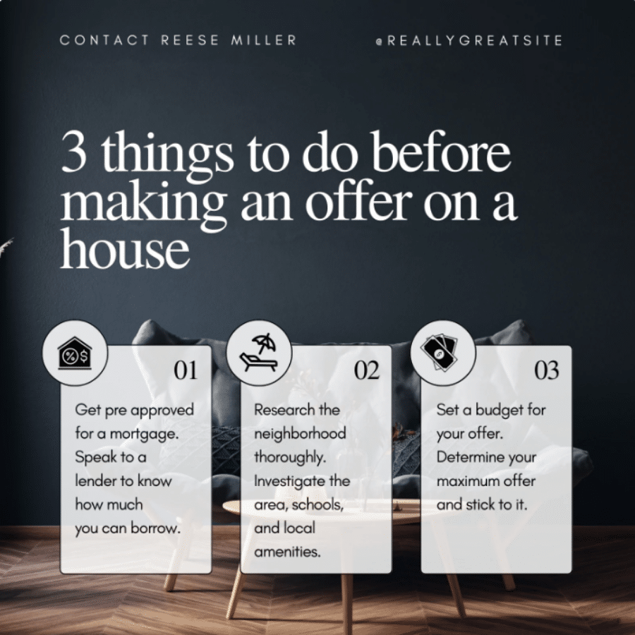
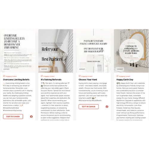
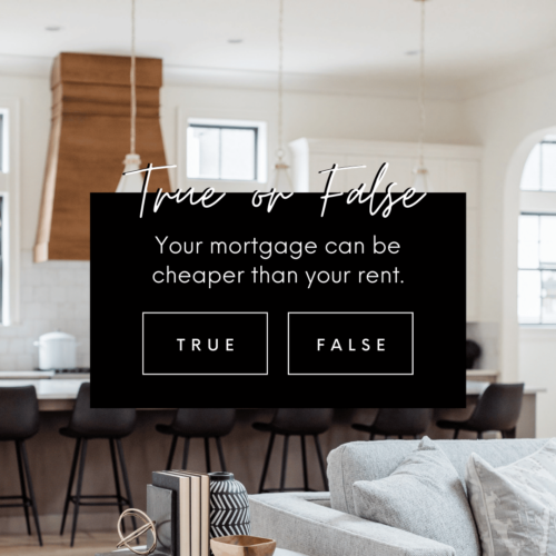
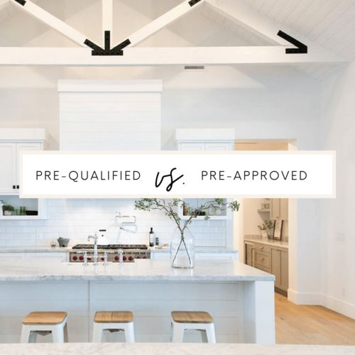
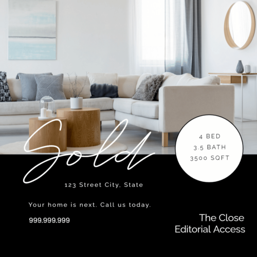
Since you’re most likely not a professional designer, one of the easiest and fastest ways to create your gorg graphic designs is to use templates. Most of the platforms created for DIY design come with a plethora of templates, including some easy-to-customize social media templates you can peruse and customize to fit your brand. Check out some amazing templates I’ve seen in the wild below.
Templates from Coffee & Contracts
Templates from Canva
Templates from Agent Crate
Inspo: Examples of Real Estate Graphic Design That Slays
Here are some gorg examples of well-designed real estate marketing materials to inspire and guide you in creating your own designs.
Example 1: SERHANT.

If you’re looking for inspo for your branding, look no further than the man who has created one of the most recognizable brands in real estate—Ryan Serhant. This logo is one of my personal favorites for a myriad of reasons. It’s clean. Simple. And confidently stated. It’s simply his name in all caps and blocky letters, but the period at the end makes all the difference. Serhant. Period. See what I mean?
Example 2: The Agency
I know a lot of people on the internet talk about The Agency, including some of us here at The Close. But I can’t help but love how clever this real estate logo is—a bent paperclip in the shape of an “A” and the simple title underneath. It’s so simple, it’s brilliant. The white sans serif font on a bright red field stands out and screams sophistication. It’s a great example of less is more.
Example 3: Compass

Compass has done an amazing job with its branding, standing out as a leader in sophistication and class. Its branding conveys luxury without being bougie and techy without being boring. The simple black-and-white colors are fresh, modern, and stylish, with sans-serif all-caps lettering spaced out just enough to be open and inviting. With Compass, you’re going places.
Example 4: Aaron Kirman Partners

I love the overt masculinity of this logo—it says power, sophistication, and boldness—definitely traits shared by its namesake. The simple, black-and-white design fits hand-in-hand with the use of negative space on the website. It also fits nicely with the tagline “The Evolution of Luxury.” This logo means business, just like its namesake and the brokerage itself. If you’re looking for powerful real estate graphic design inspiration, this one ranks up there.
How & Where to Hire a Real Estate Graphic Designer
Traditionally, when a business needs graphic design work done, they hire an advertising or creative agency. Sure, that’s one way to get premium real estate graphic design for your business, but you can also hire a freelance designer, which can be more economical. A freelance designer generally works on a per-project or hourly basis.
Start small with freelancers once you’ve had a chance to check out their portfolio. Hire them to complete a few small projects to make sure they’re a good fit. Have them complete a few different types of projects—for example, a social media graphic, a listing brochure, a real estate flyer, and a postcard. Doing so will help you get a feel for how well the designer takes direction, how often they meet deadlines, and how easy they are to work with. One project isn’t enough to assess someone’s talents. Plus, you will also want to determine if they understand you and your unique brand.
Here are a few places to look for freelance graphic design for realtors, broken down by average cost and design quality. Keep in mind that prices vary based on the freelancer and task. Instead of hunting for one freelance designer, you can also run a contest on sites like 99designs, where you can pitch your project, and multiple designers will create designs. You can then choose the best option for your needs.
| Freelancer Website | ||
|---|---|---|
| Upwork | ||
| Toptal | ||
| Dribble | ||
| Behance | ||
| Working Not Working | ||
| 99Designs | ||
Fiverr |
Bringing It All Together
We’ve covered a lot of ground in this ultimate guide to real estate graphic design. From understanding the importance of visual branding to mastering design basics, you’re now equipped with the knowledge and tools to create marketing materials that will make you stand out from the competition. But remember, this is just the beginning of your design journey. Keep exploring, experimenting, and pushing the boundaries of what’s possible.
Now, I want to hear from you! What’s your favorite design tip from this guide? Have you created any killer marketing materials using these techniques? Share your thoughts, experiences, and even your designs in the comments below. Let’s keep this conversation going!





Add comment