Real estate Facebook cover photos offer a unique branding opportunity. Considering the amount of space that Facebook allots to the cover photo, they obviously place a lot of importance on it. That’s why you should think of this space as an opportunity for your real estate marketing.
And so we’re bringing you some real estate Facebook cover image inspo. I’ve compiled some guidelines for effective Facebook cover photos, along with real-life examples and what makes them so compelling. Use these examples as a blueprint to create your own real estate Facebook cover photo that will resonate with your target audience, show off your personality, beef up your branding, and attract more leads.
1. Use Scroll-stopping, High-definition Images
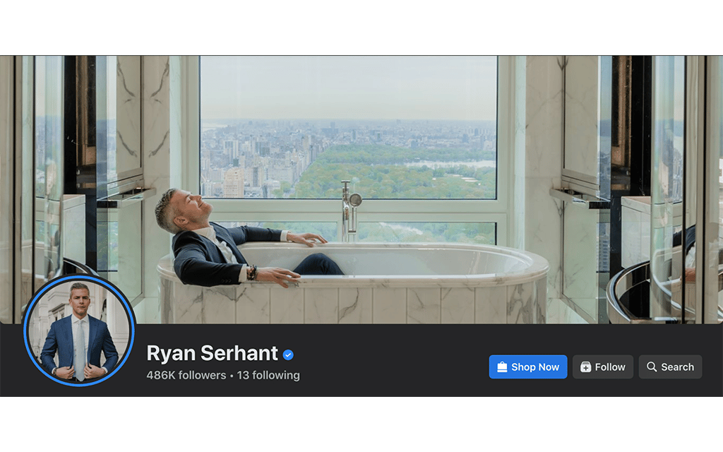
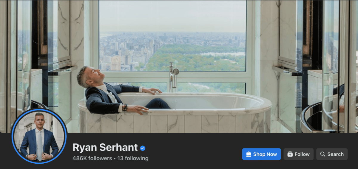
We can all learn branding strategies from Ryan Serhant, the luxury broker and “Million Dollar Listing” star who dominates all things real estate in New York City. He’s everywhere! His branding is flawless, and he’s become synonymous with high-end real estate.
And this image of Ryan screams that brand (without taking itself too seriously). Check out Ryan in this fancy-schmancy marble bathtub with that view. THAT VIEW! It’s breathtaking. And he’s lying in the tub in a relaxed pose, soaking in the elegance. In this singular image, you get what Ryan is all about. And that’s the whole point.
Can you convey your brand in one image? It’s a challenge to nail it as well as Ryan does here. But whatever you decide, make sure your images are high quality. As I mentioned, Facebook believes your cover image is important so you want to make sure it’s not too grainy when you upload it. Use a PNG file for best quality if you have a lot of text or a logo in your cover image. It should also be in a 16:9 aspect ratio, at least 400 pixels wide by 150 pixels tall.
2. Target Your Niche Audience With a Specific Property Type
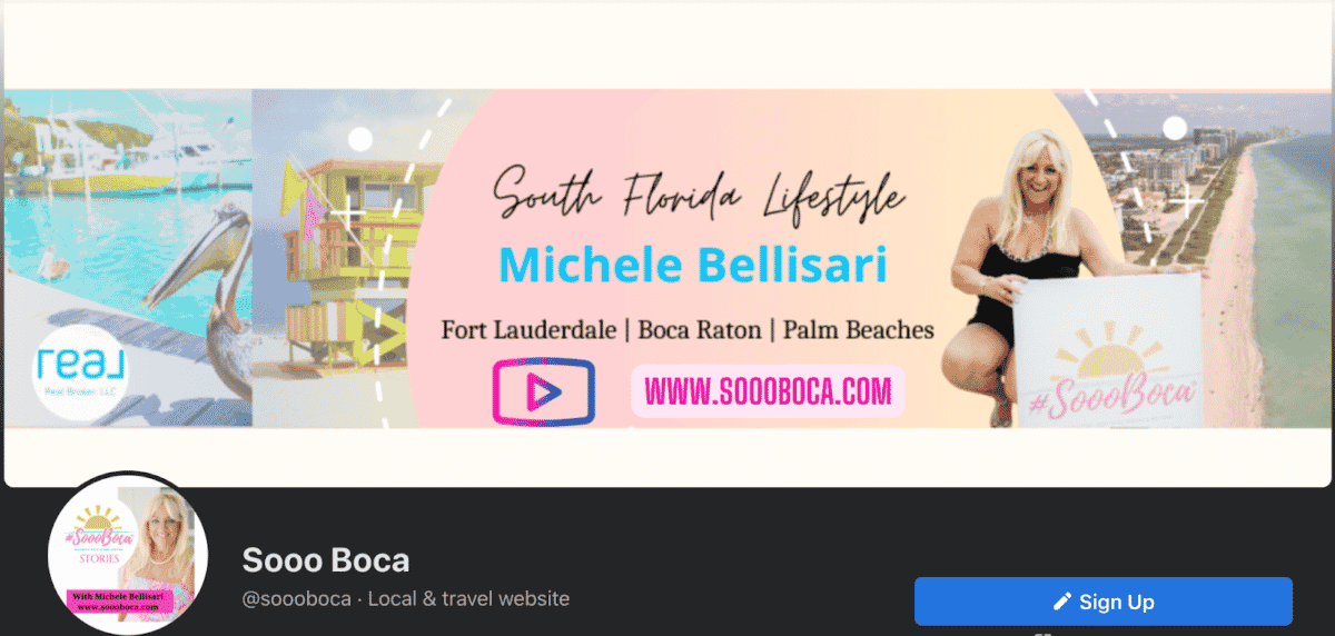
Michele Bellisari is known for her colorful Facebook and Instagram posts promoting the South Florida lifestyle in Boca Raton. Her Facebook cover photo features bright South Florida colors, the beach, the sun, and the fun lifestyle she’s targeting.
Your Facebook cover image should convey who you are and who your audience is in a single photo. But if just one image doesn’t do that, don’t be afraid to combine several images into one, as Michele has done here. You can easily create a cover image like this in Canva. In fact, two of the three templates we created for you have multiple spots for images.
3. Include Your Business Tag Line in Your Image
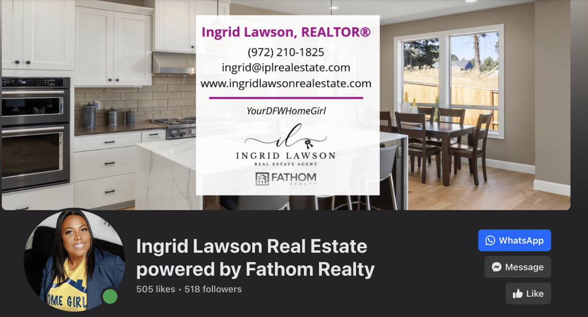
Ingrid Lawson uses the tagline, “Your DFW Home Girl,” and I am here for it. She helps people find homes in the Dallas area metroplex, which means she’s a busy woman. But Ingrid is doing it in style and with a smile.
In this one image, you see that Ingrid is authentic and warm with a stellar sense of style. Oh—and check out her outfit—it even references that same tagline! Who wouldn’t want to work with someone like that?
4. Stand Out With Your Brand Colors
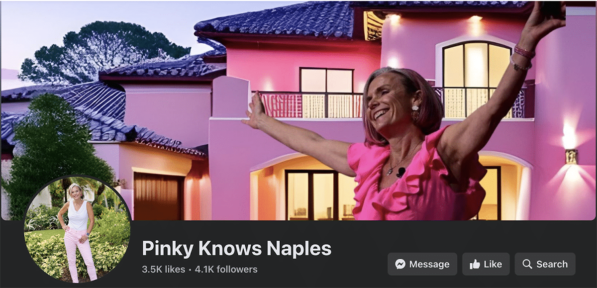
Sue “Pinky” Benson really goes all-in when it comes to color branding. You can quickly recognize her page on Facebook, as well as Instagram, by all the shades of pink. She even has pink in her hair! She’s 100% committed to her brand.
Pinky hails from Naples, Florida, and shares enthusiastically about her community on all of her socials. And it’s impossible not to link her vibrant persona with the iconic pink flamingos of her home state, precisely the imagery she intended.
Grow your database with a steady stream of affordable, exclusive real estate leads from social media ads. Social Connect from Top Producer is designed to get you a high volume of leads and move them through your pipeline until they’re ready to buy and sell real estate. Connect with an average of 30 consumers interested in real estate in your local market for just $300 per month!
How Social Connect works:
5. Feature Images of Your Location
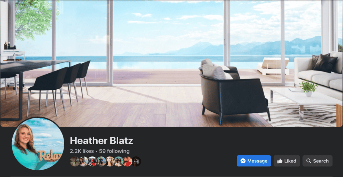
Heather Blatz wants you to relax and let her take the wheel. With her beautiful Facebook cover image, you get the sense that she can sell your home and alleviate all your stress. This soothing photo—alongside her clever headshot—conveys a hint of her specific location, which is coastal Florida. Even though Heather has since changed her Facebook cover image, I still think this version is a great one.
Heather’s visitors know her market is not just real estate. It’s a lifestyle of luxury coastal living. You can glean that from the gorgeous photo of a luxury coastal home with a view of the water in the background. Makes you want to go on vacation, am I right?
6. Include a Strong Call to Action in Your Image

Not all Facebook cover images include a call to action (CTA), but if you can make it work, you should. There is a CTA button just below the image, but for greater effect, include a CTA in the image itself. In fact, you can even direct your readers’ attention to the button from your image.
Mark Spain leans into this idea in the biggest way. His entire Facebook cover is a call to action with a cutout of himself. And since he’s already in the cover image, he wisely uses his profile pic to show his logo. It looks great and gives his readers clear direction on how to begin working with him. I love the simplicity of Mark’s cover image and the concise direction. It’s a clear message that stands out.
7. Let People See Your Personality With Your Headshot
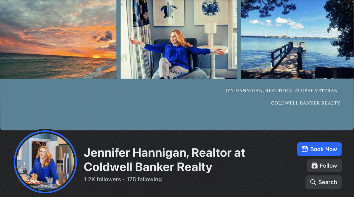
Jen Hannigan isn’t afraid to let people get to know her. She includes “USAF Veteran” in her Facebook cover photo, along with a couple of photos of her just being herself. Her two headshots, one of her in a lounge chair and another of her in the kitchen, show off her relaxed and confident personality.
Jen looks open and friendly, flashing her beautiful, assuring smile. She is subtly sending the message that she’s ready to help her clients find their next investment property.
So, if your smile is your logo and your personality is your business card, then make sure those things are on display with your Facebook cover image in order to create a stellar personal brand.
8. Keep It Simple & Easy to Understand

Melanie Atkinson loves Tampa Bay. And she makes that clear in her Facebook cover image. It’s simple, elegant, and straight to the point. The reason this works so well is that she uses her logo in conjunction with her profile picture, so you get to see her beautiful face and bright smile.
But more importantly, she uses her Facebook cover photo CTA to redirect people to her YouTube channel, which is filled with tons of videos. Video is her primary marketing tool, so it only makes sense to direct people who find her on Facebook to her platform and medium of choice. The Watch Now button just below her cover image takes you directly to her channel on YouTube, where you can get to know more about Melanie, her team, and, of course, Tampa Bay.
9. Show Off Your Team
Elham Ghaderian knows how important it is to show prospects who they will be working with. She put together this gorgeous Facebook cover image featuring all the members of her team. By putting their beautiful faces front and center, Elham knows she’s building that trust factor and attracting potential clients to her brokerage.
No matter how big or small your team is, including them all in the cover image literally puts a face to the group. People connect with people, not businesses.
10. Showcase Your Listings

Speaking of high-quality photos, a great way to market your real estate business is to include some of your previous listing photos in your Facebook cover image. Make sure you get permission from your photographer and sellers first, and then choose some gorgeous photos like the Van Buren Real Estate Group has here.
11. Try Using a Template

Canva is one of my favorite tools, and I love exploring the tons of templates it offers, including Facebook cover templates. Facebook changes its platform often—in fact, they’ve taken away the ability to use video and slideshows from the cover photo in just the past couple of years. But it’s easy to create a new Facebook cover in minutes so you can stay on top of what works and what doesn’t inside the platform. Scroll back up to the top and download the templates I created in Canva—you’ll see how simple it is to customize them for your own business.
I made the one you see above in less than five minutes. I like it so much I’m thinking of using it on my actual Facebook page. There’s so much you can do inside Canva; it’s the perfect tool to stay on top of all your design work quickly and easily.
Next Steps to Level Up Your Real Estate Facebook Cover Photo
Your branding is everything when it comes to your real estate Facebook cover image. Your cover image, like most of your social media marketing, can help you look like the pro you are, or it can damage your brand and keep you from growing your business. Always put the best possible product out there to keep your image polished.
Creating a stylish real estate Facebook cover image doesn’t have to be complicated or take a lot of time. You can easily repurpose some of your existing marketing tools to design a stunning and effective cover photo for your page. We know you want to make your Facebook page work for you, so implement some of these best practices to get the most out of that space at the top of your page.
Do you have any additional suggestions that I didn’t mention? Do you do something different that is generating business? I would love to hear about it. Share your secrets with me in the comments.


