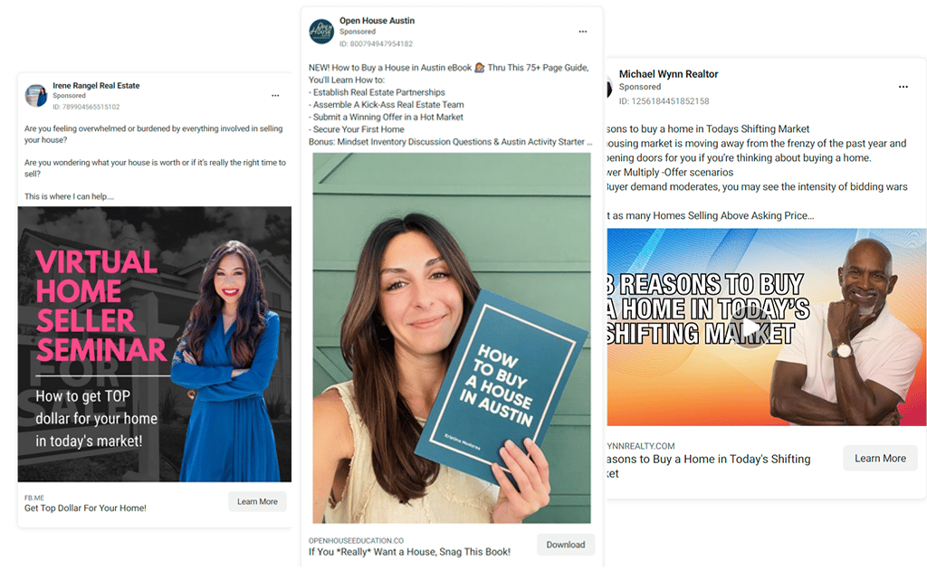
Engaging with your local community is not just a strategy; it’s key to making your real estate ads incredibly powerful. By investing time and effort, you will establish yourself as your area’s go-to real estate expert, a crucial role for the community. To inspire you to create ads that attract attention and strengthen your brand, check out this curated list of 44 amazing real estate agent ads. I’ll also provide an in-depth analysis of the ad’s lead magnet, copy, and design, proving that creating exceptional ads is well within your reach!
Social Media Real Estate Ads Examples
Advertising on popular social media platforms like Facebook and Instagram is always a game-changer for real estate agents. According to the National Association of Realtors (NAR), social media (52%) is the top tech tool that provides REALTORS® with quality leads. You only need a killer concept, a captivating lead magnet, compelling copywriting, and creative flair to reel in those leads on Meta’s top platforms. I’m here to show you some of the best real estate ads on Facebook and other platforms and explain why they’re so effective.
Cost to advertise: This depends on the social media network; it requires a minimum ad budget of $0 to $8 per action.
Time investment: Ad creation can be time-consuming, especially in addition to consistent posting on your feeds at least three times per week.
Lead quality: Medium to high
Return on investment: High
1. Buyer Quiz Ad

Lead magnet: Quiz
Why this copy works: This copy starts by leveraging first-time buyers’ FOMO (fear of missing out) and then cleverly offers a solution. What’s particularly effective is how it speaks directly to the person reading, making them feel valued and important rather than addressing a general audience. Instead of a generic image, they opted for a picture of the agents teaching the course. This choice makes the agents appear friendly and approachable, creating a sense of familiarity and comfort for the first-time homebuyers they’re targeting.
Pro Tip: Don’t have the time or patience to learn Facebook ads? Top Producer Social Connect makes it easy. Enter your city and budget, and Top Producer’s advertising experts do the rest. Even better, you’ll get a suite of automated lead nurturing tools to keep them warm while you work with clients.
2. Reasons to Buy a Home Video Ad
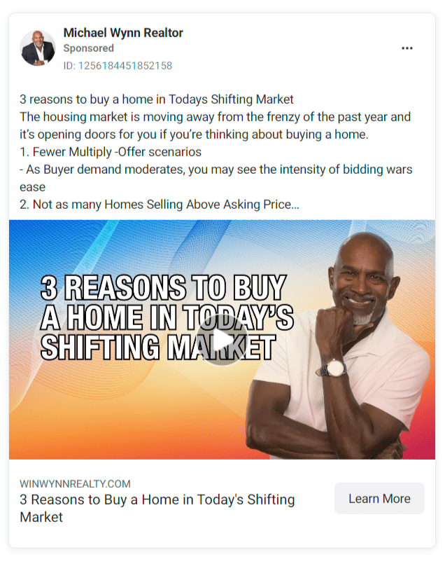
Lead magnet: Video
Why this copy works: This content appeals to individuals who are hesitant to decide on the current market conditions. It presents three compelling reasons the real estate agent believes the present time presents a favorable purchase opportunity. The use of bold text, a vibrant background, and a warm, professional image of the agent is visually appealing and establishes the agent’s expertise and credibility. This will help to build trust with potential buyers, making them more likely to consider the offer.
3. Home Valuation Ad
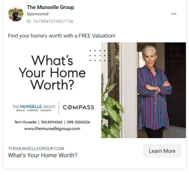
Lead magnet: Free home valuation
Why this copy works: It’s simple and straight to the point. Emphasizing the word “free” helps draw in people who have not sold a home before and don’t know that all home valuations are free. I love how the agent added a casual yet professionally shot picture of herself. This unique approach sets her apart from other agents and is sure to intrigue and engage potential customers. Too many home valuation ads use bland, generic graphics; we would bet this one converts much better.
4. First-time Homebuyer Tips Video Ad
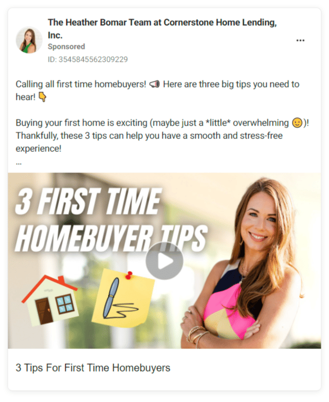
Lead magnet: Video
Why this copy works: This language is light and fun but gets straight to the point and uses emojis to guide the reader through the real estate ad. The video’s title, in bold and attention-grabbing italic font, immediately draws your attention. This element of intrigue makes the audience feel drawn in and curious, but still professional.
5. Simple Exclusive Listing Ad
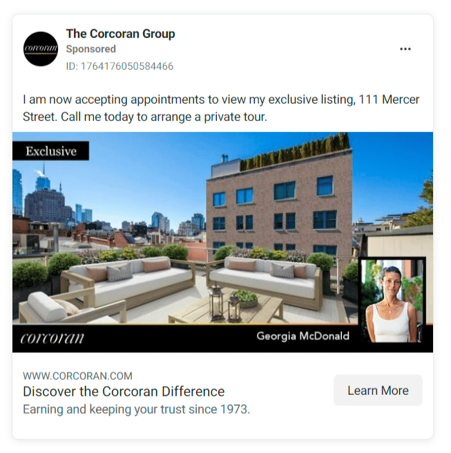
Lead magnet: Private tour
Why this copy works: With only one sentence, this copy cuts through the noise on social media and gets straight to the point. Using the terms “accepting appointments” and “private tour” not only makes the listing sound exclusive but also emphasizes the value of the experience, making potential clients feel intrigued. It is simple but very effective: gorgeous photography, brokerage branding, and a headshot in the lower right corner. This professional presentation instills confidence in potential clients, making it perfect.
6. Simple Exclusive Listing Ad: Example 2
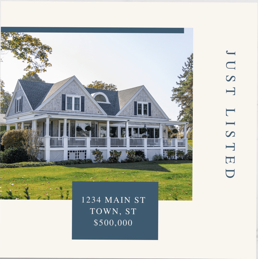
Lead magnet: Private tour
Why this copy works: This ad’s success lies in its simplicity. A professional image, precise address, and straightforward price, all presented in an elegant font, instill confidence, rendering additional copies unnecessary. This template is a versatile solution that can be adapted for a wide range of marketing needs. It’s not limited to private tours but could also be used for open houses, under contract, or just-sold real estate ads. Apply your brand colors and logo, and you’re ready to go.
7. Simple Open House Ad
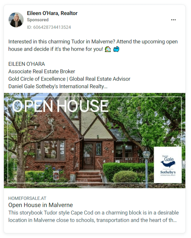
Lead magnet: None
Why this copy works: Once again, the power of simplicity shines through in this copy. It cuts through the noise and gets straight to the point, instilling confidence in the reader. The two charming emojis add a touch of personality without overwhelming the message. Again, simplicity is key! The beautiful real estate photography, clean graphic design, and company branding strategically placed in the lower right corner reinforce the audience’s role in shaping the company’s identity.
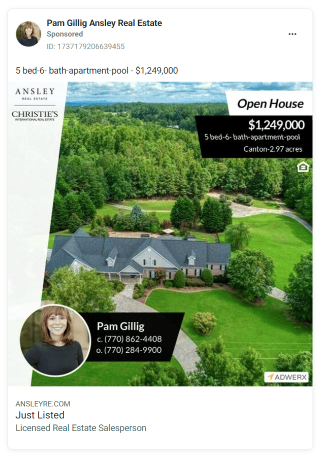
8. Open House Ad With Aerial Shot
Lead magnet: None
Why this copy works: The ad’s effectiveness is not reliant on many copies. Instead, it impresses with its minimalistic approach, relying on the strength of its creativity to capture the audience’s attention. Coupled with decreasing attention spans—now just 8.25 seconds—complex ads cause more confusion than conversion. The bold, clean design, a testament to the ad’s effectiveness, draws the audience’s eye into this ad. The headshot and contact information are on the lower left instead of the more traditional lower right, but it still works.
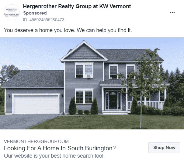
9. Buyer Lead Ad
Lead magnet: None
Why this copy works: This copy is a masterclass in leveraging FOMO and desire. In just two sentences, it taps into the universal longing for a home we truly love. It cleverly positions its website as the key to alleviating the audience’s FOMO. It’s all about simplicity! This is not a grand mansion but a humble, approachable home. It’s nice but not intimidating, making the audience feel comfortable.
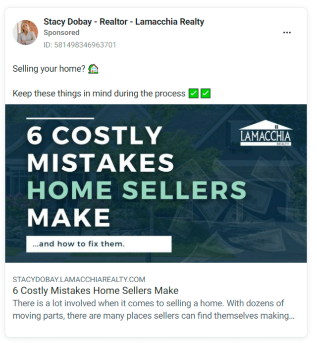
10. Six Costly Mistakes Homesellers Make Ad
Lead magnet: e-Book
Why this copy works: This copy empathizes with the fears that every homeseller experiences before, during, and even after putting their home on the market. Even better, it offers a solution to help them overcome those fears. It won’t win any graphic design awards, but it certainly grabs your attention. Photography or graphics would just distract from this simple, powerful copy.
Are you considering social media ads for your property but find the process of creating, posting, and testing them time-consuming? Experience the benefits of Sierra Interactive’s Real Estate Ad Management tool. With just a budget setting, you can leave the rest to them, allowing you to focus on other crucial aspects of your property sale!
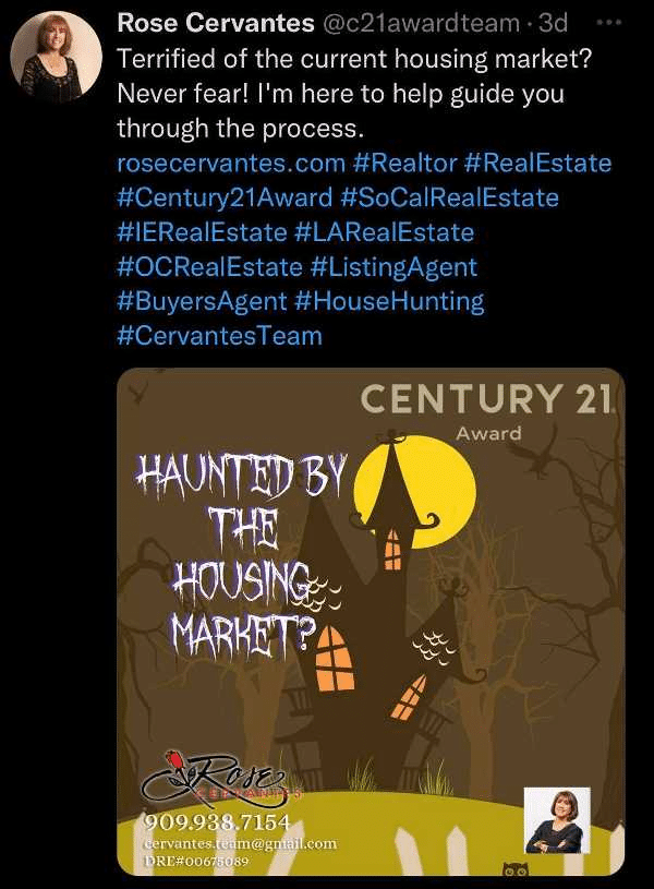
11. Seasonal Ad for X (Formerly Twitter)
Lead magnet: Seasonal theme
Why this copy works: Be sure to take note of this intriguing social media post on X (formerly Twitter). The post is designed to grab the attention of potential buyers and sellers and encourage them to learn more about the sales process. Its seasonal theme makes it especially timely and appealing for the Halloween season. It cleverly incorporates the theme into the question, “haunted by the housing market?” and includes a professional headshot and contact details, making it easy for viewers to see them.
12. Short-video TikTok Ad
Lead magnet: Short-video
Why this copy works: Heider Real Estate has achieved tremendous success by harnessing the power of TikTok to showcase its listings. With an astounding 3.7 million followers, Daniel Heider effectively uses trending songs and music to make property listings more entertaining and engaging. Furthermore, as shown in the example above, instead of just showing the property, Heider included real people in the house, allowing potential buyers to visualize themselves enjoying the property, a strategy that has proven effective on such a large scale.
13. Funny Real Estate Memes or Jokes
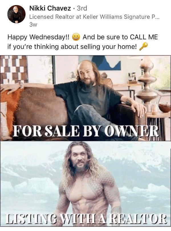
Lead magnet: Real estate memes and jokes
Why this copy works: Remember to incorporate real estate memes into your social media strategy to highlight your property listings, personality, and brand. Using memes is an engaging and lighthearted approach to grabbing the interest of your audience and establishing a sense of rapport with your page visitors.
14. Real Estate Quote
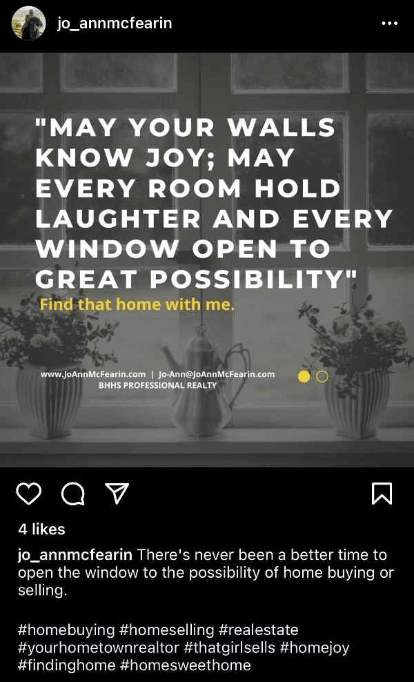
Lead magnet: Real estate quotes
Why this copy works: The tagline in this post is strategically crafted to appeal to potential home buyers. It uses a simple and comforting image to evoke positive emotions, drawing on inspiration and joy to drive the message home. This is followed by a clear call to action, prompting the audience to take the next steps toward purchasing their dream home.
Outdoor Real Estate Ad Examples
The outdoors is more than just a path from your car to your listing. Many enjoy activities like walking dogs, jogging, and riding bikes. The outdoor advertising market is projected to reach USD 43,900 million by 2028 with a 3.9% Compound Annual Growth Rate (CAGR) during 2023–2028, underlining its enduring value in a competitive marketing landscape. The great outdoors is a good place to reach people who may not use the latest apps. Here are some cool outdoor real estate agent ads.
Cost to advertise: This depends on size, duration, medium, and location. For example, out-of-home ads bulletin billboards can cost anywhere from $60 to $10,000 monthly and up to $20,000 in large cities.
Time investment: This needs low time commitment after an ad is created.
Lead quality: Medium to high
Return on investment: High, especially for brand recognition
15. Sense of Home Scratch & Sniff Ads
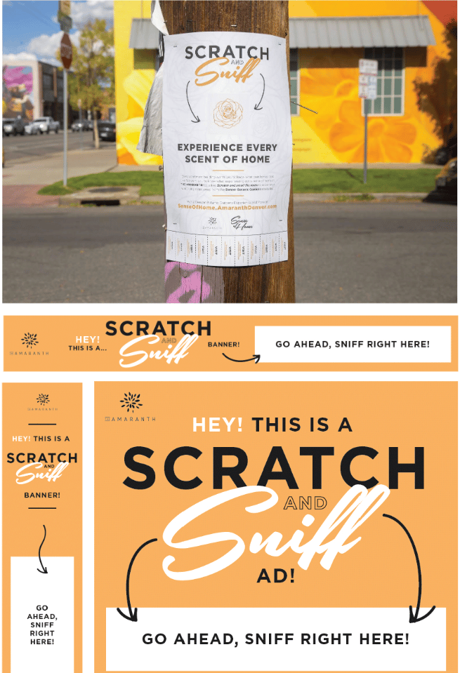
Why This Copy Works: These eye-catching and freshly scented scratch-and-sniff ads— designed by Agency Fifty3 for a new development in Denver, Colorado—are enough to make your average curious resident stop in their tracks. Once they’ve got your attention, the message behind these ads—that even new developments will become “home” rather than just a place to live—it really hits the mark.
Why this copy works: These eye-catching and freshly scented scratch-and-sniff ads are designed to make you feel part of a community. They are enough to make your average curious resident pause. Once they’ve got your attention, the message behind these ads—that our new developments foster a sense of ‘home’ and community rather than just a place to live—resonates deeply.
16. Compass: Powering Your Home Search

Why this copy works: A great pun works wonders, and this copy brings everyone in on the joke. These slickly designed and clever ads on electric car charging ports send the perfect message to the very kind of hip, upwardly mobile, and eco-conscious clientele every brokerage covets.
17. Stribling Building Listing Signs
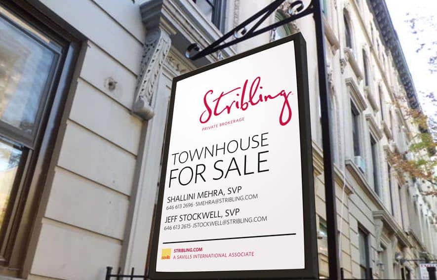
Why this copy works: This well-made listing ad signs leaves a lot up to one’s imagination. I know there’s a townhouse for sale on a gorgeous, tree-lined street. Maybe that’s all we need. I like the mystery. The simplicity here lets the environment do the heavy lifting, and the bright pink logo elevates the overall look, keeping the ad from feeling stale or boring.
18. Halstead Outdoor Ads
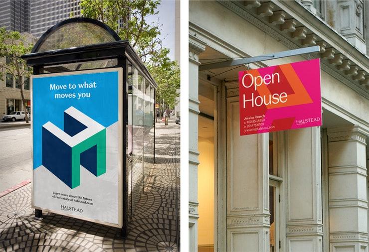
Why this copy works: In the first example, Halstead uses a clever play on words in hopes their audience will pause just one second longer. “Move to what moves you, huh? That’s clever. What’s this? Halstead? I’ll look into them.” This second example lets the bright poppy colors do the heavy lifting. It’s hard to ignore the vibrancy, and an open house with this chic of a sign is probably a property worth seeing.
19. Realtor.com Subway Ad
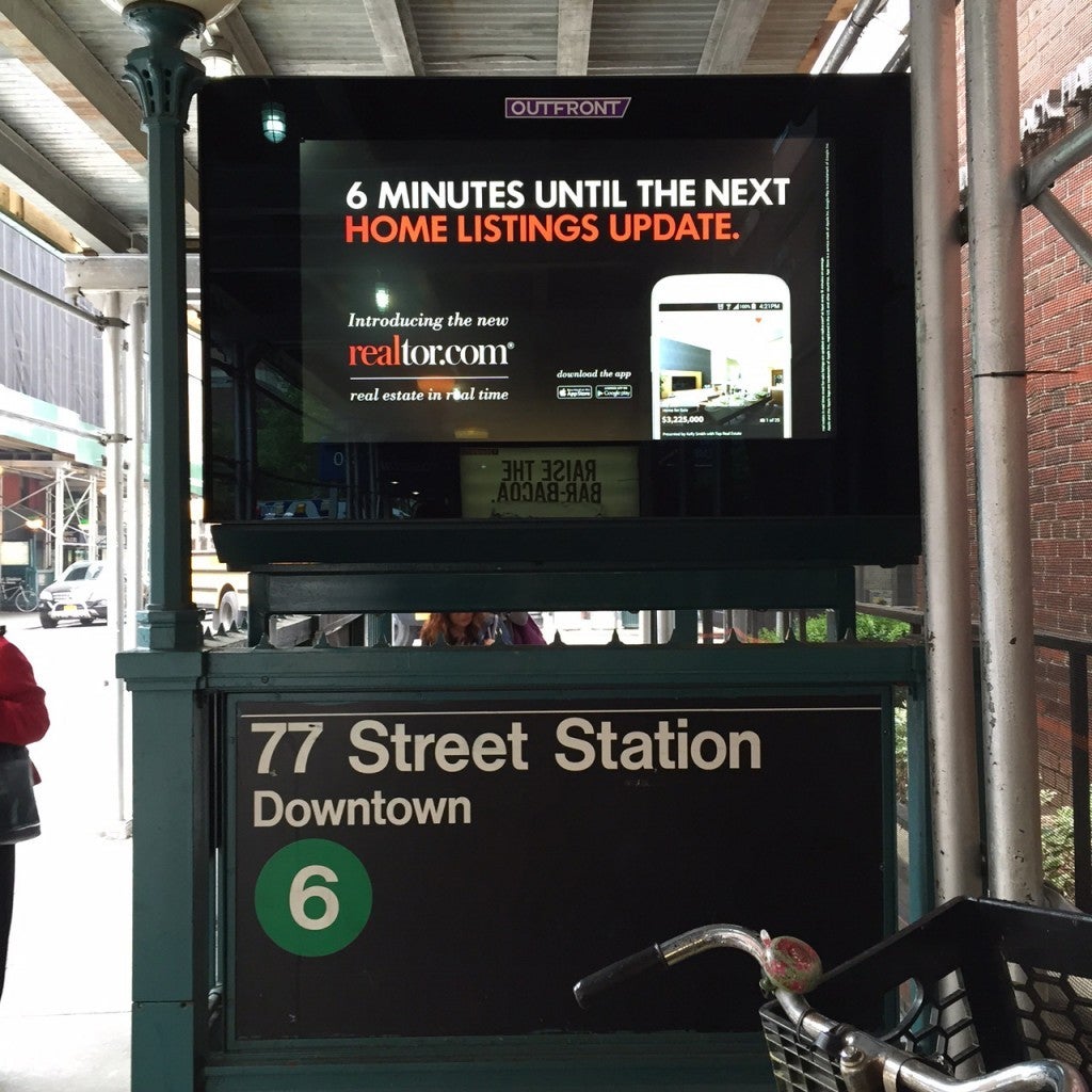
Why this copy works: Making a pun about the subway seems like a rite of passage (ha!) for advertising execs cutting their teeth on transit signage. Realtor.com’s ad here, on the other hand, is well thought out. The cheeky play on the ad’s placement—an LCD that alternates between ads like this and upcoming subway departures—makes this ad stand out.
20. Realtor.com House Wrap Ad
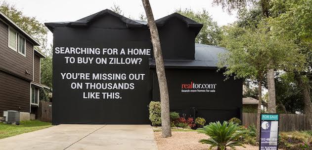
Why this copy works: This message uses FOMO to entice its audience to switch from Zillow to Realtor.com. A tried-and-true ad strategy. No one wants to miss out on something great. This type of ad can go viral and take on a life of its own. It’ll get people talking, sharing and, above all, checking out Realtor.com.
21. StreetEasy Subway Ad: ‘You’re Dead to Me!’

Why this copy works: This speaks to New York City or any other metro with a massive chip on its shoulder. It gives the audience confidence that the agency is in the know, speaks the language, and has true local bona fides. StreetEasy’s subway ads have always been clever, but these ads take an old-school monster fight from classic movies and insert humorous things that New Yorkers tend to argue about—in this case, moving to LA.
Print Real Estate Ad Examples
The rumors of print advertising’s death have been wildly exaggerated. An eMarketer.com survey found that 82% of Americans trust print ads in newspapers and magazines more than digital ads (only 61% of consumers). Also, some real estate agents still swear by the persuasive qualities of ink and paper. Are they right? Well, judge for yourself. Here are a few killer print ads that we bet will have a great return on investment—or will at least help grow brands.
Cost to advertise: This can vary from local to national reach, ranging from $50 per ad to thousands.
Time investment: Ad design can be time-consuming but will not require consistent posting as with online platforms.
Lead quality: Likely high
Return on investment: Medium due to the higher cost of print
22. Douglas Elliman: Ask Elliman
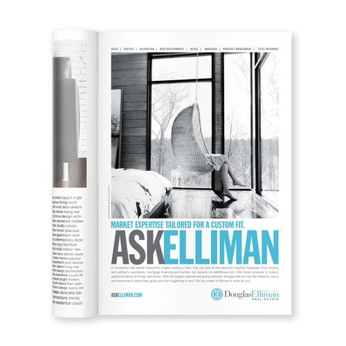
Why this copy works: Still one of our favorite real estate agent ad campaigns of the past few years, Douglas Elliman’s “Ask Elliman” campaign hits all the right notes. It manages to evoke expertise and care at the same time. The Elliman-branded blue pops against black, white, and gray shades. It has a slightly nostalgic feel but is appealing to just about any audience in a modern setting.
23. NAR: Most Valuable Square Inch
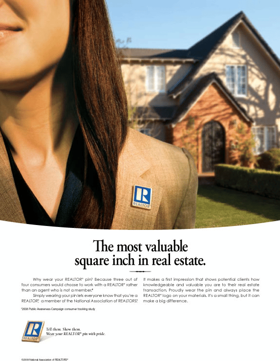
Why this copy works: This magazine ad makes the NAR aspirational, if not damn near heroic. The copy creates a club that you want to be a part of (or that we want to represent our interests in). I don’t need to see the Realtor’s face to know she’s trustworthy, has integrity, and will sell this house. Or help you buy it. This is an ad that shows us as much as it tells.
24. Lefferts Place Mews
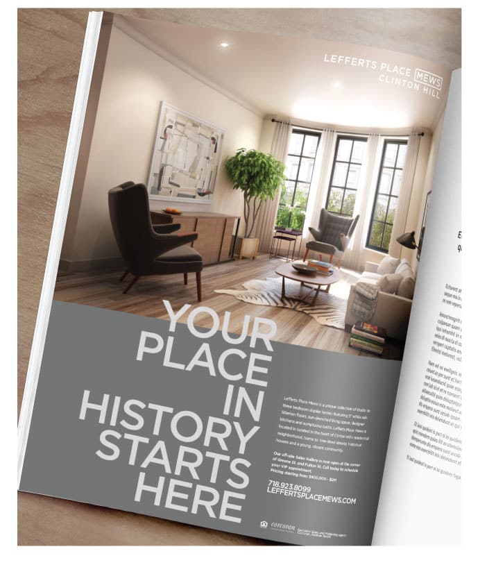
Why this copy works: This copy makes you contemplate your legacy, hopes, dreams, and maybe even hints that the “life is short—buy the pretty house” argument. Of course, it also works on a literal level—it’s a historic property.
25. Nourmand & Associates: New Hire Announcement
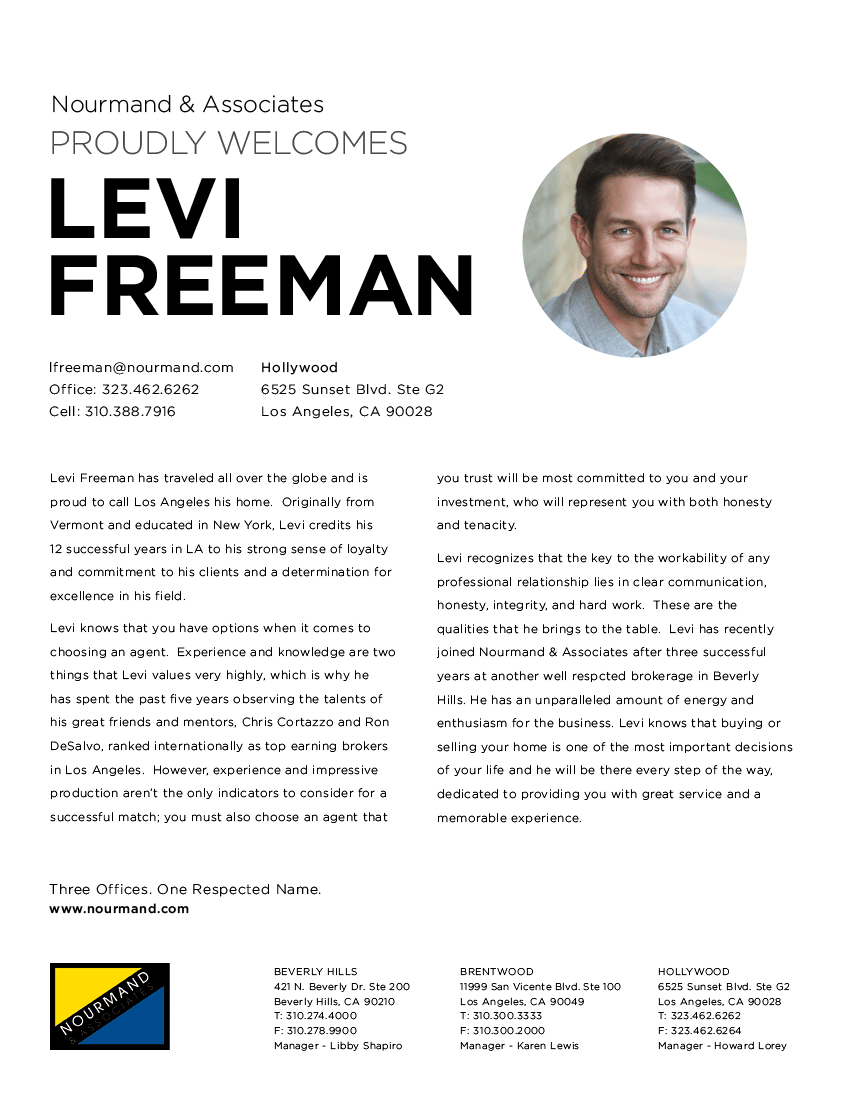
Why this copy works: OK, you’re probably wondering why I put a new hire announcement, of all things, on this list, and I’ll admit it—it’s not really for the copy. It’s for the design. This example showcases why it’s crucial to sweat the small stuff to get ahead. The typography, layout, and imagery are all pinpoint perfect.
26. Compass: Door Hangers
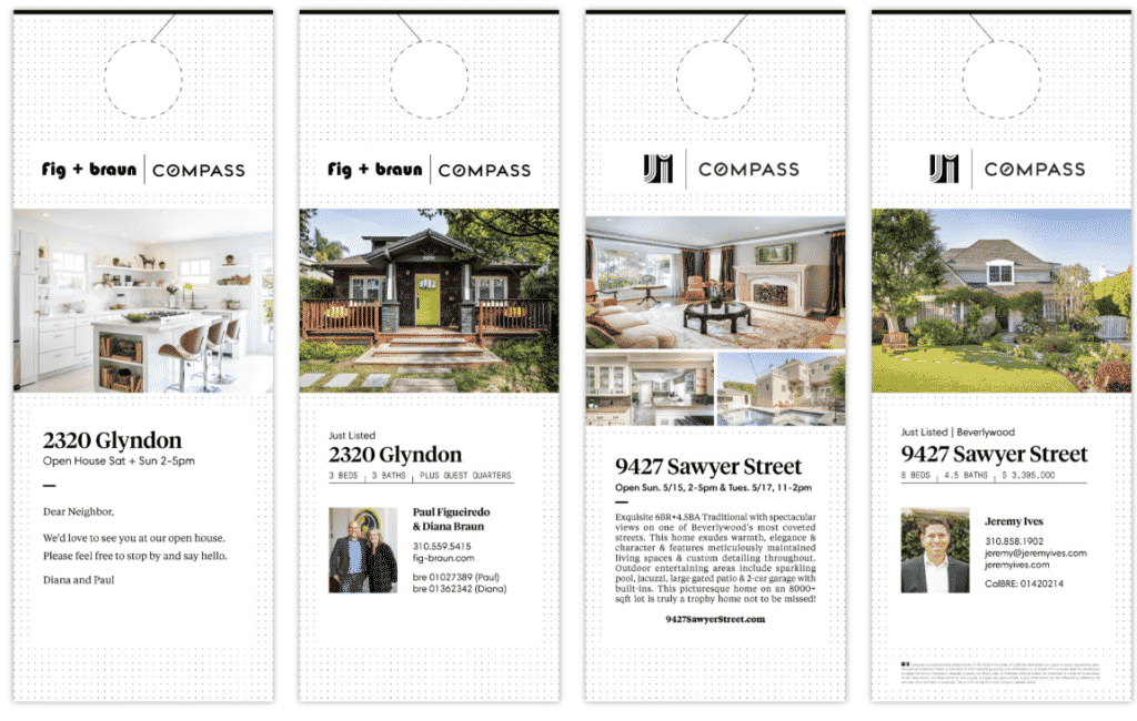
Why this copy works: These just-listed and open-house door hangers ideas keep the message simple and let the properties and headshots do the talking. Door hangers are often a check-the-box marketing tool, but if you take the time to think about layout, images, and overall design, they can make a huge impact. Instead of going right into the trash can, someone will pause, take in the beautiful property photos, and maybe even read that testimonial.
27. First Mallorca: Taylor-made Houses

Why this copy works: How clever are these ads for Mallorca-based luxury real estate firm First Mallorca? The “Taylor-made houses” line makes it. It’s a fresh approach to the idea that this brokerage is focused on the client as an individual. The image works here, reinforcing the idea that each buyer or seller is as unique as the properties.
28. Sotheby’s International Realty
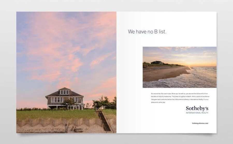
Why this copy works: Clean, classic, eye-catching images and pithy copy are everything you need to get the most out of a two-page layout. This Sotheby’s campaign is about creating a vision of an aspirational and familiar lifestyle.
29. Corcoran’s ‘Live Who You Are’ Campaign
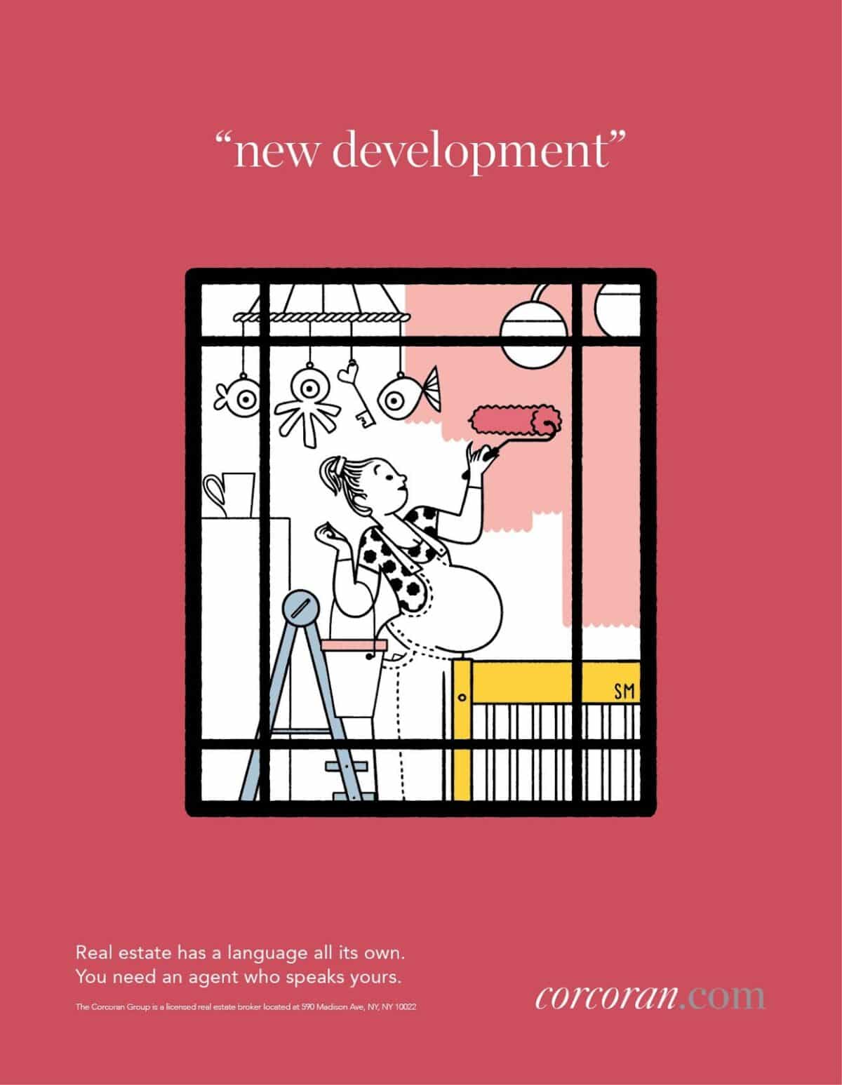
Why this copy works: I’m enchanted by this whimsical take on Corcoran’s core statement, which celebrates the life you’ll live in your new home. These illustrations by Simone Massoni are fun and clever while still evoking emotion. Other Corcoran print campaigns showcase photography by Rob Howard, Annie Liebovitz, Paul Costello, and Stefan Anderson. The Corcoran brand believes that storytelling fosters loyalty, and I agree.
If we had to pick a single real estate brochure company to recommend, it would be ProspectsPLUS! It has marketing print collateral in almost every format and size, plus no membership fee. Some providers require a monthly subscription to access designs, but ProspectsPLUS! works well for one-off projects and ongoing campaigns.
Real Estate Brand Promotional Items Examples
Your headshot, logo, and other branding can be used on items like pens, notepads, and similar items for promotion and advertising. Giving away these items can help potential clients and existing customers remember your professionalism, skill, and dedication. According to a study, 40% of consumers keep some promotional items for over 10 years. That’s longer than most other types of advertising. Another study found that 83% of people like getting promotional products with an advertising message.
Cost to advertise: Depending on the items purchased, the cost can range from a few cents to thousands each, and less when purchased in bulk.
Time investment: Once the item is designed and complete, no additional time is involved; plus, successful items can be re-ordered with no extra design time.
Lead quality: Medium to high
Return on investment: High
30. The Helpful Branded Fridge Magnet
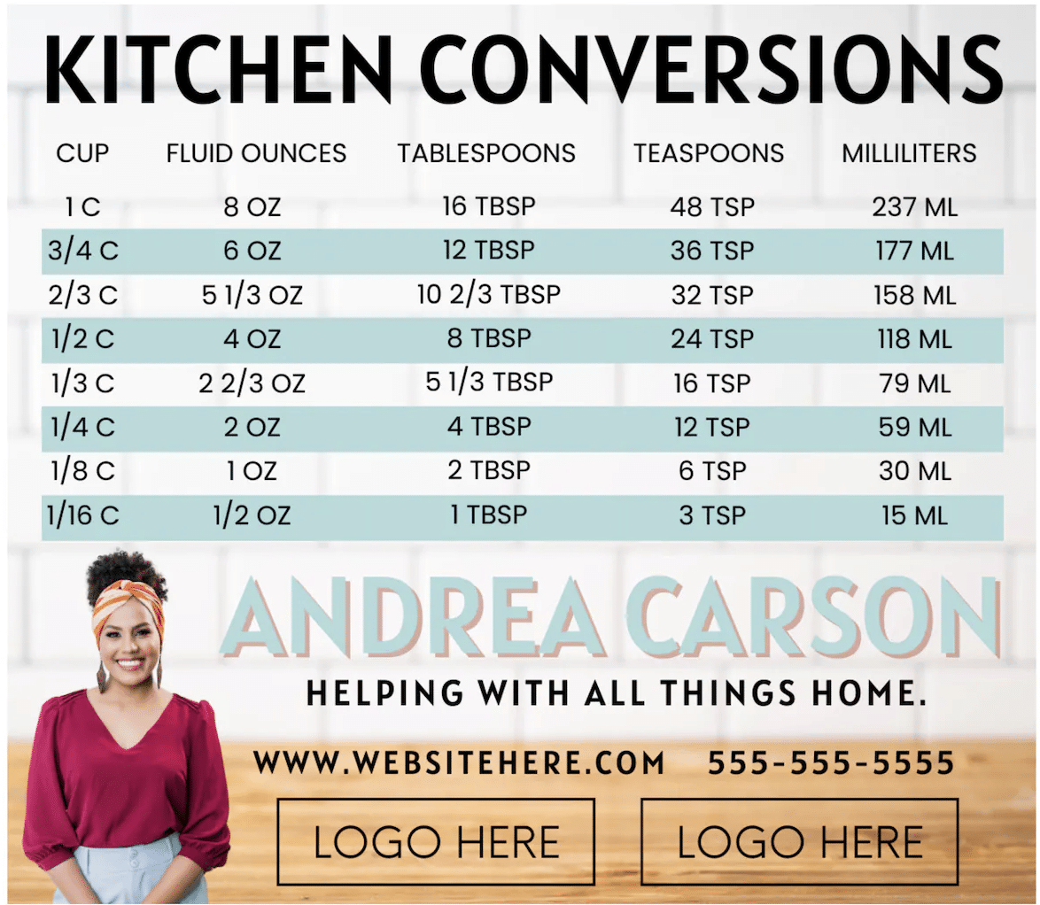
Why this creative works: I’m a big fan of any longevity promotional item. This helpful, well-designed magnet will live on the fridge, reminding leads that one cup equals 8 ounces and that you are there any time, day or night, to help with real estate.
31. Custom Mug of Your Mug
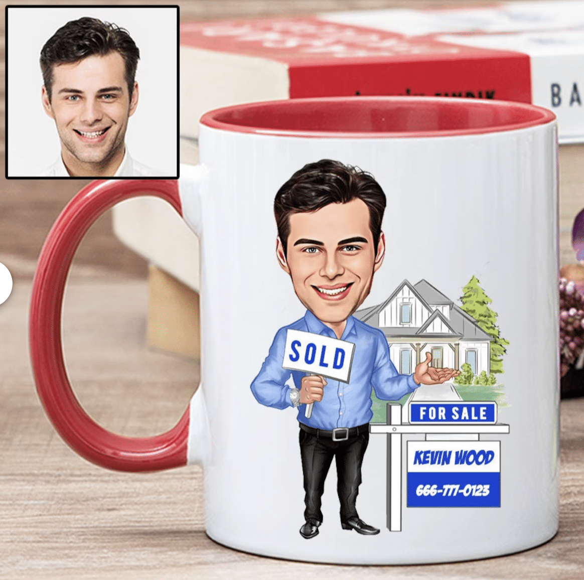
Why this creative works: Branded mugs are pretty common, but this illustrated, customized mug has real personality and is likely to stand out among all the clutter in your kitchen.
32. Brokerage Ready-to-Wear Line

Why this creative works: Sometimes, you need your brand to make a statement. It helps when there’s an emphatic period at the end. This SERHANT. hoodie sweatshirt is classic, warm, and brilliant advertising. Imagine people walking around wearing your brokerage name on their clothing, hats, fanny packs, or even swim trunks—it doesn’t get much better than that.
33. Branded Pen Ad
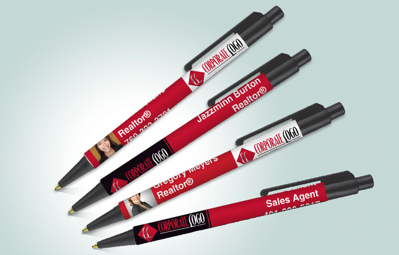
Why this creative works: Discover the power of promotional pens! By putting your contact information and logo on a pen, you’re not only providing a useful tool, but also spreading your brand to a wide audience. Imagine handing out these pens at open houses, listing appointments, networking events, or giving them to buyers as they sign on the dotted line. It’s a brilliant way to get your brand out there and make a lasting impression!
34. Tote Bags
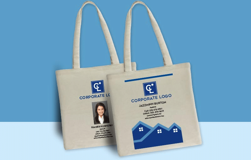
Why this creative works: Branded reusable bags and totes are a massive hit with eco-conscious individuals. When you add a catchy slogan, your contact details, and your logo to a bag, just like the example above, your customers essentially become walking billboards for your brand.
Internet Platform Best Realtor Ads Examples
To attract real estate leads, advertise on high-traffic sites like your local multiple listing service (MLS), Zillow, Realtor.com, Trulia, and Craigslist. Use Google, Microsoft ads, Yelp, and your website to establish your expertise. Since 41% of recent buyers’ first step in the home buying process was to look online at properties for sale, ensuring that your ads stand out in the crowded online landscape is crucial. Here are some successful real estate ad ideas and what makes them stand out:
Cost to advertise: Depending on the platform and scope of work, the price ranges from free to hundreds of dollars per month.
Time investment: Ads for realtors are frequently templated, making them easier to create, but still require you to spend time keeping listings up to date.
Lead quality: Low to medium
Return on investment: Medium
35. Zillow Active Property Listing
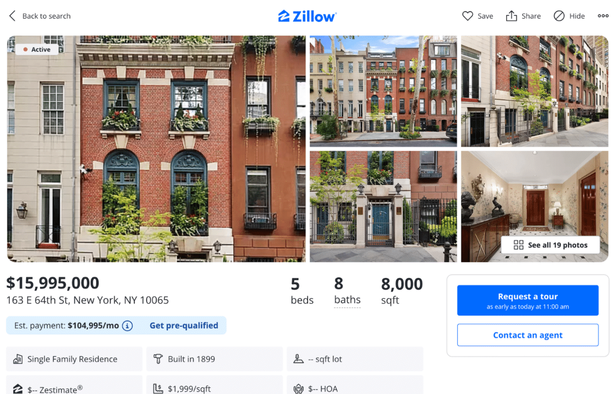
Why this creative works: This Zillow property listing is effective because the agent, with their professional approach, uses visually stunning images to capture the reader’s attention. The listing also highlights the benefits and details of working with their firm, instilling a sense of confidence. High-quality photos and compelling property descriptions are included to encourage visitors to linger and browse.
36. Google Paid Advertising
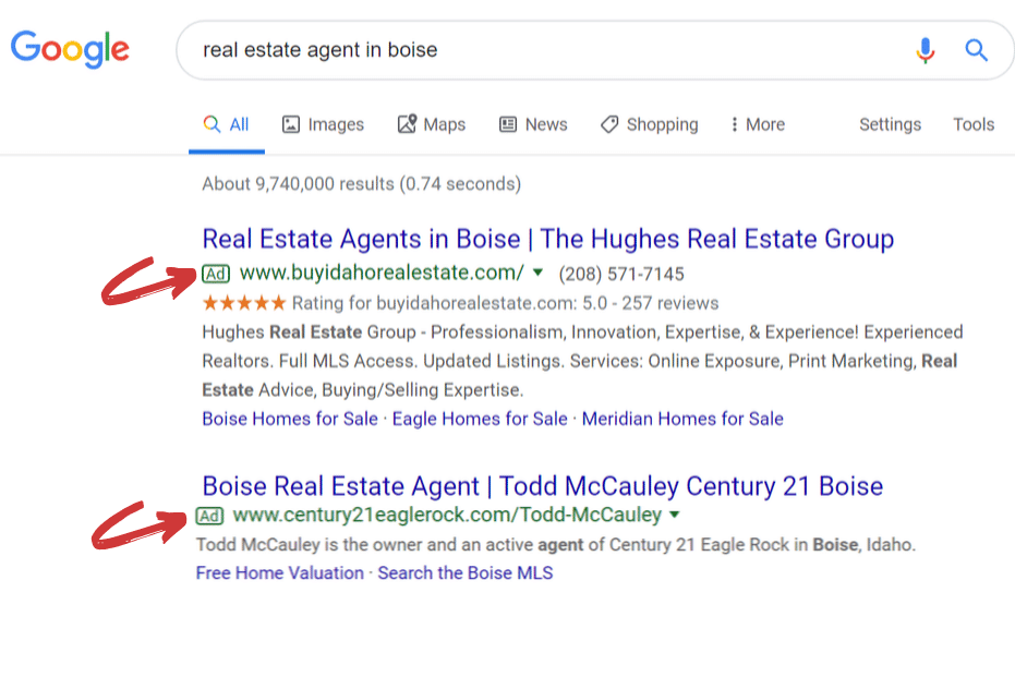
Why this creative works: This awesome Google ad may not have any images, but it’s a powerhouse for generating real estate leads. Using targeted keywords and showcasing the brokerage’s impressive 5-star Google My Business profile ratings, this ad pulls in leads from Google in a specific area like a pro!
37. Real Estate Agent Sponsored Google Ad
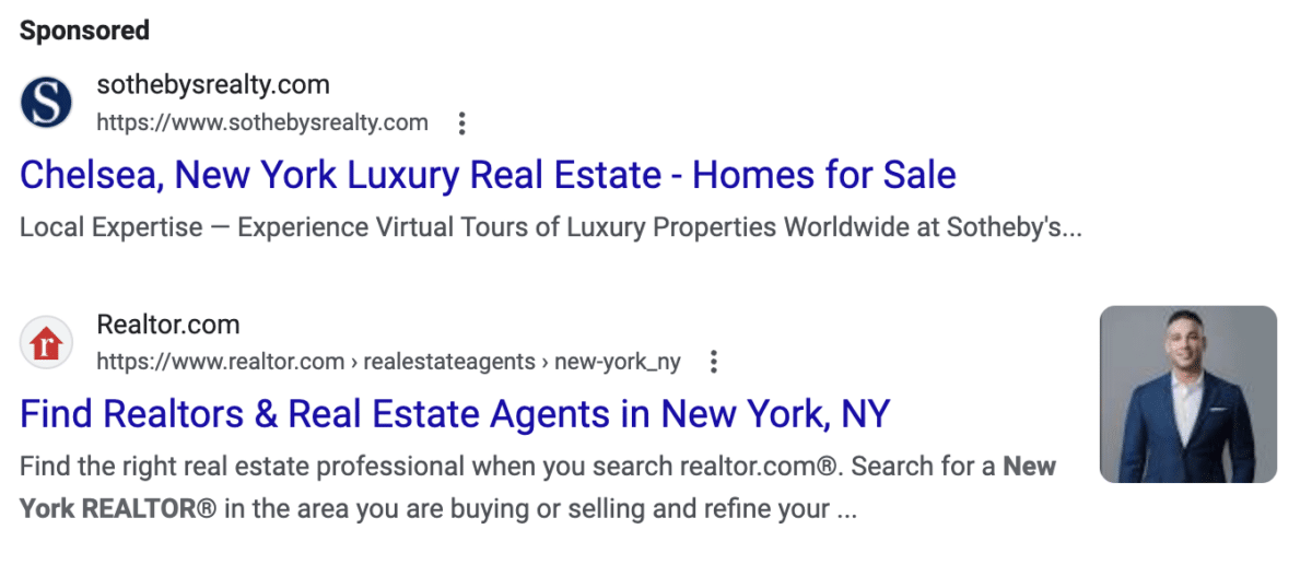
Why this creative works: This sponsored real estate agent Google ad is effective because it showcases a professional realtor headshot, adding a personal touch and credibility. The eye-catching headshot helps establish a connection with potential clients, conveying trust, professionalism, and a human touch. This ad is designed to make a lasting impression on its target audience!
Direct Mail Real Estate Ads Examples
Direct mail strategies like postcards and flyers are still super effective for generating leads. They make you stand out, grab people’s attention for longer, and pack a bigger emotional punch than digital ads. Plus, even though they might cost more than online ads, they’re still pocket-friendly for agents. And here’s the best part—you can target specific audiences based on demographics and niche markets, making it super efficient for generating leads in your specialized areas of expertise!
Cost to advertise: This depends on your design, mailing lists, marketing copy, printing, volume, and distribution; it ranges between 30 cents to $10 per piece of mail.
Time investment: This needs time to design and execute mailing strategy, but can be fast-tracked with online tools.
Lead quality: Medium to high
Return on investment: Medium
38. Mailable Real Estate Flyer
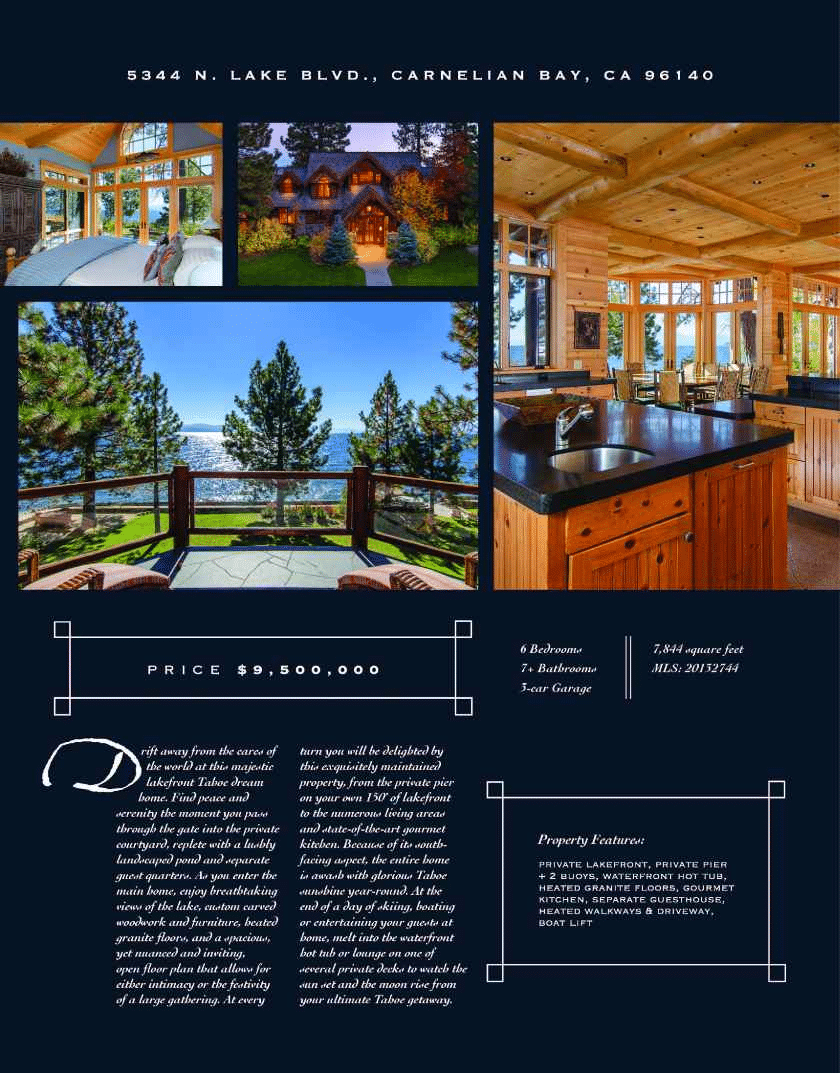
Why this creative works: This mailable real estate flyer displays a local home in the area with captivating photos to entice buyers and provides sellers with a sample of its high-quality marketing materials. All you have to do is choose a specific neighborhood or get a mailing list for a particular street from a direct mail service, and presto! You’re all set to send out your personalized real estate flyers.
39. Recipe Direct Mail Postcards
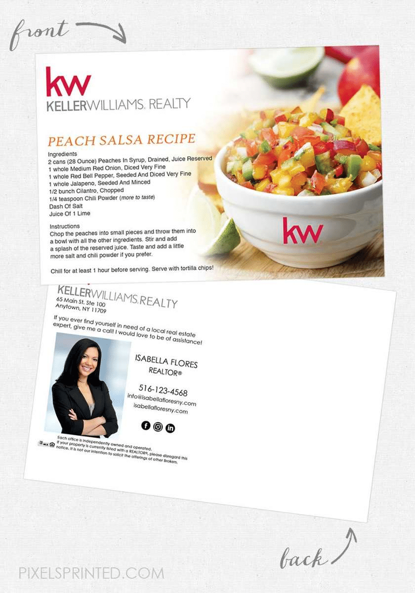
Why this creative works: This clever direct mail real estate agent postcard targets potential sellers. It includes a fantastic recipe that not only grabs attention but also gives people a reason to hold onto the card. By regularly sending out postcards with different recipes, you will ensure your brand is always on your contacts’ minds.
40. Personalized Calendar
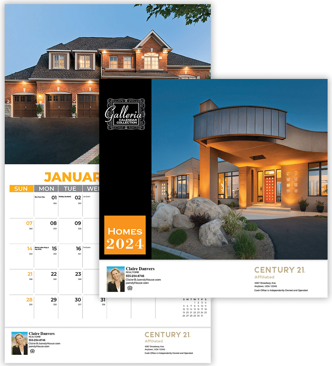
Why this creative works: Branded calendars, such as the one provided, are valuable household items that constantly remind you of your brand. These personalized calendars are not only excellent gifts for clients but also for potential clients, as well as friends and family. By displaying your information, these calendars can help maintain brand recall and serve as a practical and thoughtful token of appreciation.
Direct Digital Real Estate Ads Examples
Many businesses have effectively used digital campaigns in real estate. According to Statista, 70% of consumers prefer to receive emails from online brands. Effective strategies include clear headlines for direct emails, monthly newsletters, and holiday emails with recipes or tips. Let’s explore some appealing real estate agent advertising examples for digital ad campaigns and why they successfully generate and convert leads.
Cost to advertise: It is free for one-to-one or email and text marketing plans, or a few dollars per month and up when using paid online platforms.
Time investment: Using an online platform can save time with templates; individual email can be more time-consuming.
Lead quality: Low to medium
Return on investment: Medium
41. Direct Email Ad
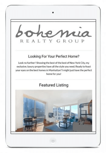
Why this creative works: This straightforward email is effective due to its concise headline, which presents a question to potential buyers. The email copy provides a solution that highlights the real estate agency’s expertise and features its current listings. Use these emails to share your listings with your email subscribers.
42. Direct Text Ad
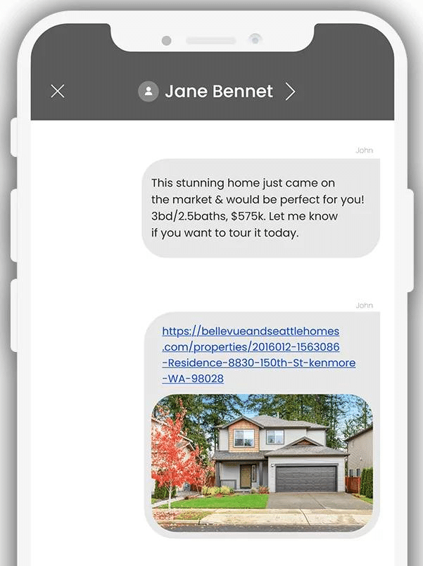
Why this creative works: This real estate advertisement informs buyers ready to buy by advertising an open house through the highly effective medium of text message marketing. Text messaging is a powerful way to update your contacts about new listings. With a higher open rate of 98% compared to email’s 21.7%, it’s an incredible way to remind clients about upcoming events or open houses or to check in with them.
43. Monthly Newsletter
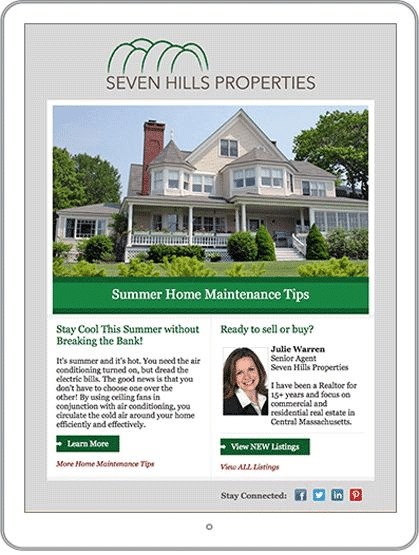
Why this creative works: A monthly real estate newsletter sent directly to your inbox is a powerful tool for lead generation. It fosters consistent engagement, showcases your expertise, highlights your listings, and provides detailed market updates. But it’s not just about information, it’s also about action. Its call to action is designed to motivate and encourage readers to take the next step, whether it’s exploring your listings, contacting your agents, or making a conversion.
44. Holiday Email

Why this creative works: One of the most effective and non-intrusive ways to engage with your clients is through holiday emails. These emails, unlike traditional sales pitches, are a subtle yet powerful way to reinforce your brand and humanize your relationship. These catchy real estate ads are not pushy or salesy but a gentle reminder to your clients that you’re thinking of them. And for even more impact, share them on your social media platforms. Check out our real estate holiday calendar so you will never miss out!
Frequently Asked Questions (FAQs)
How do you write an effective real estate ad?
When writing a real estate ad, start with a compelling headline that grabs attention. Provide concise property details, highlight unique features, use high-quality images, mention neighborhood advantages, include contact information and a solid call to action. Proofread for accuracy and clarity. Tailor the ad to the target audience to maximize its impact.
What is the basic rule of advertising in real estate?
When advertising real estate, always get permission from other agents before promoting their listed properties. Identify yourself as a real estate agent, include your brokerage firm’s name, and ensure their contact information is easily accessible. Be honest in your advertisements and avoid exaggeration or misrepresentation to build trust with potential clients.
Do Facebook real estate ads work?
Yes, Facebook ads can be effective when done right. Successful real estate ads on Facebook allow precise targeting of potential buyers or sellers. The platform’s enormous user base and engagement features create ad exposure and interaction opportunities. However, the success of the ads depends on their quality, targeting, and budget. Careful planning and monitoring are essential for successful real estate ads on Facebook.
Bringing It All Together
Remember to use attention-grabbing taglines, eye-catching images, and imaginative content in your real estate ads. Spreading your ads across multiple channels is essential to connect with a larger audience. Advertising is a crucial investment for a thriving real estate business. Have some powerful real estate ads you’d like to show off? Or do you have some insights about upcoming trends? Share your thoughts in the comments!


